Qovery
Qovery – the DevOps automation platform – recently came to us with a challenge: rethink their positioning in order to establish themselves as the leader of an emerging category and continue their international expansion.
The perfect opportunity to think big!
Beyond their desire to move away from a speech too focused on functionalities, they wanted to inject into their branding their boldness and their sharp spirit. And above all, to build a brand that appeals to an American audience with high standards, thanks to a striking tone carried out by simple, impactful words.
Brand platform, editorial tone, visual identity, website… here is an overview of our work:
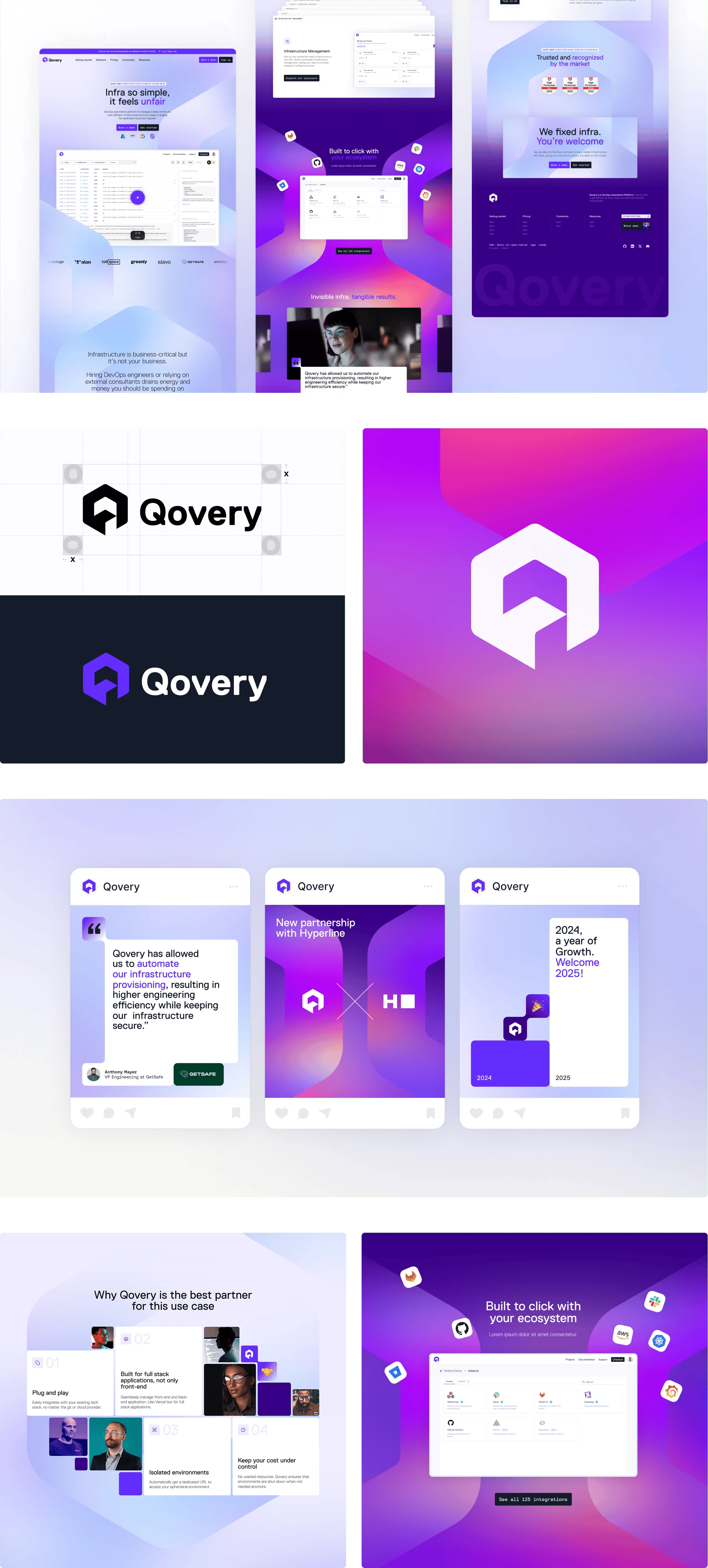
• We repositioned the brand by reinforcing the promise: simplify and automate the work of developers as much as possible. The idea: “DevOps that is so simple, it feels unfair,” where DevOps becomes a true strategic lever for the company.
• Qovery’s verbal identity is confident, energetic, impact-oriented and direct. In this logic, we find key messages such as: “Run your business, not your infra” or “We fixed devops. You’re welcome.”
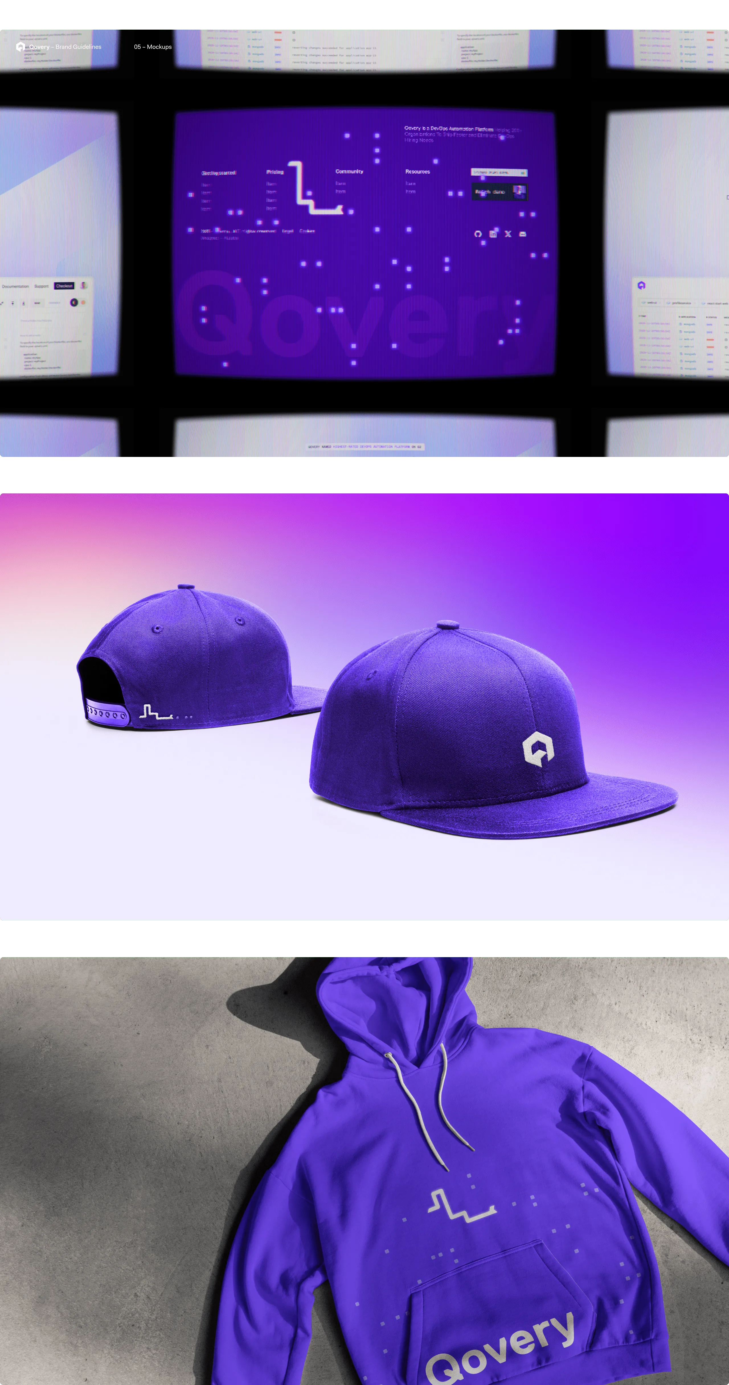
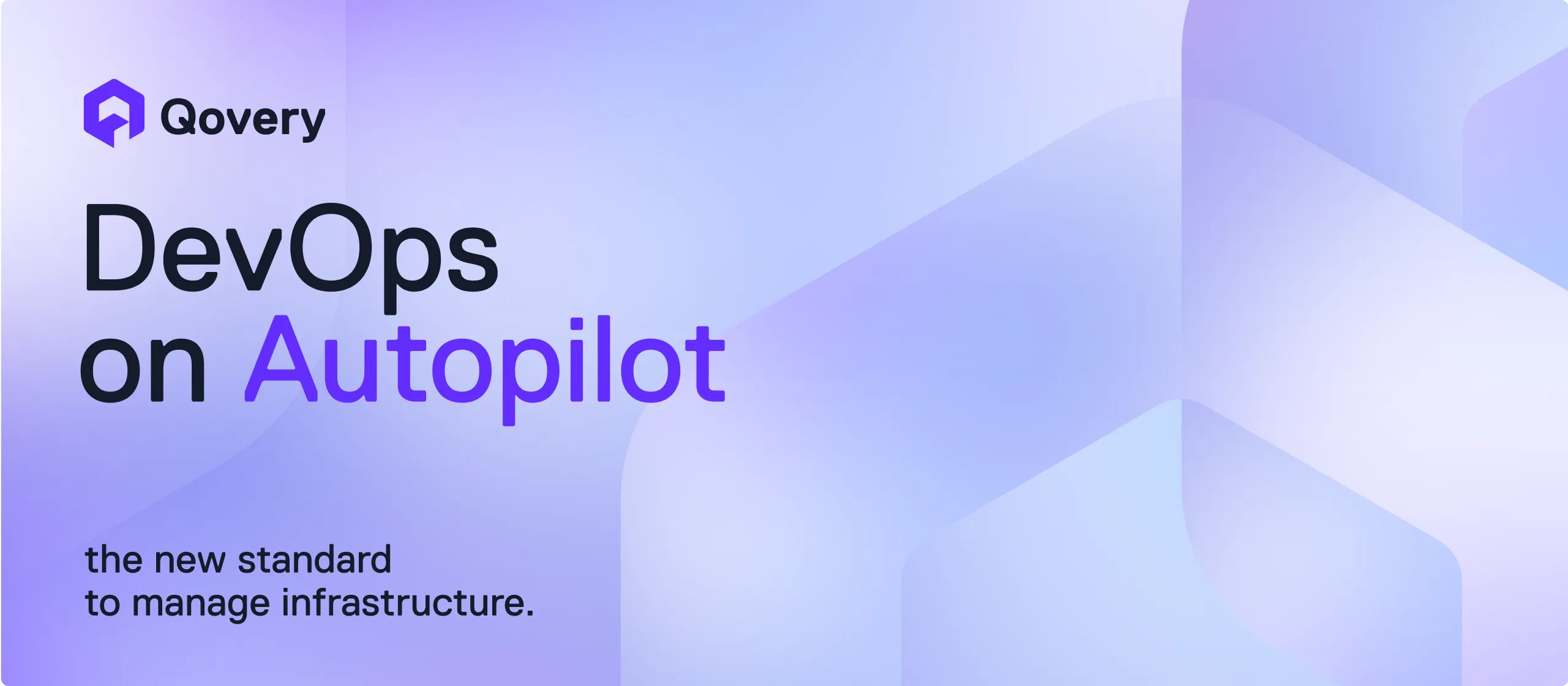
• The Qovery logo takes the shape of a “Q” built from a 3D cube. Its design becomes a graphic pattern, used to give depth and coherence to the compositions.
• Qovery purple stands out as a strong visual marker. Worked in shades, the palette plays with light, dark, and gradient variations to enrich the brand universe.