Skynopy
After creating their very first logo to support their launch, the team came back to us with a new challenge: building a complete brand ecosystem to match their growth.
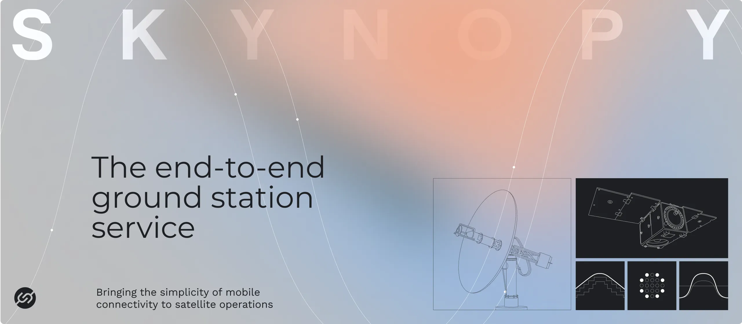
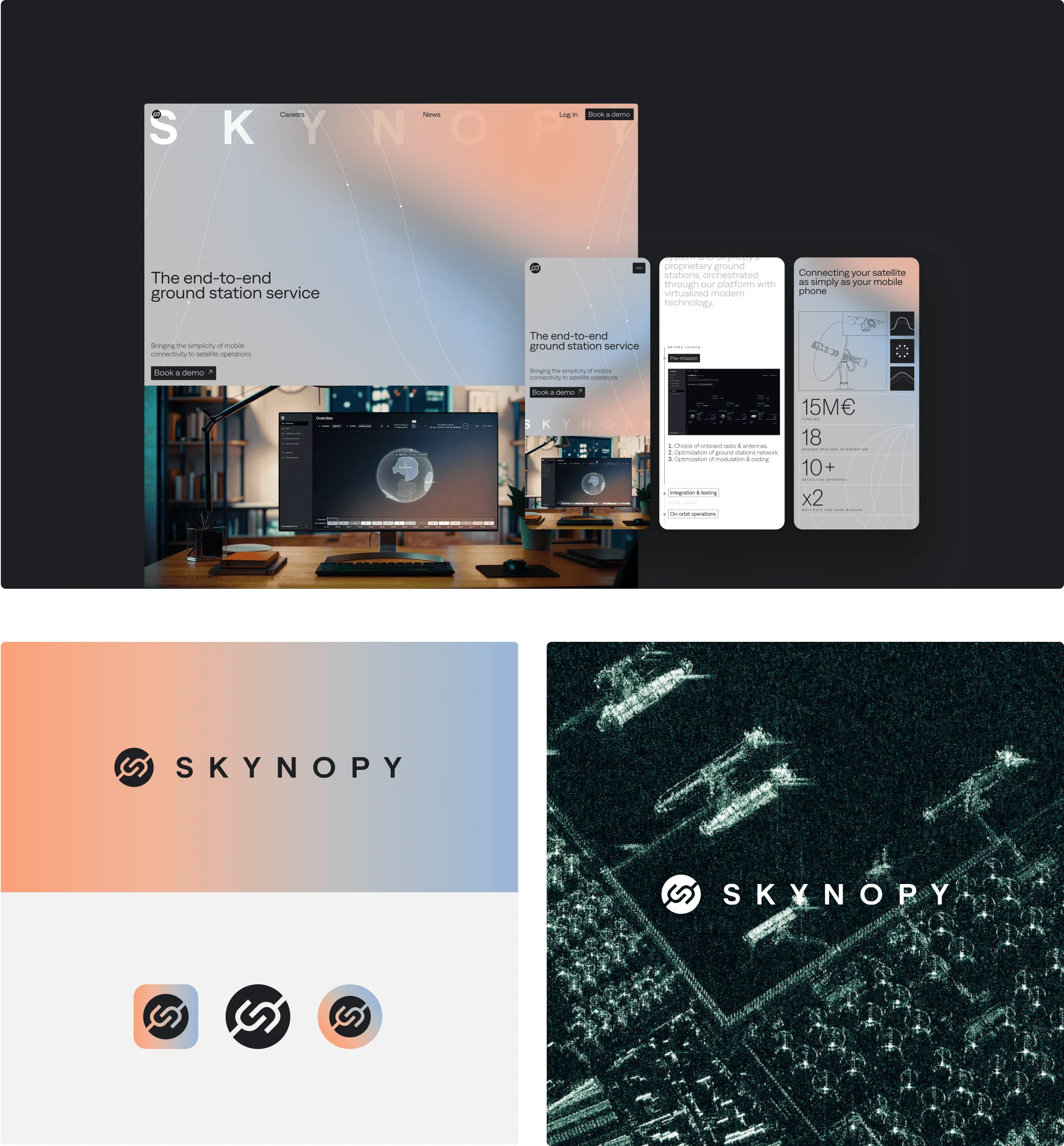
As Skynopy scaled, they needed a visual identity that projected their expertise and worked seamlessly across every touchpoint — from trade show booths and business cards to brochures, pitch decks, social media and more.
Our take? A sophisticated visual universe that references space without falling into clichés:
• The core color palette dissolves into elegant gradients, evoking the vastness of space and the layers of Earth’s atmosphere. The backgrounds, used on grey or black, are enriched by abstract representations of satellite ground tracking — a subtle nod to the brand’s technical DNA.
• The visual language builds on monochrome technical illustrations and icons. Maps are a recurring motif, designed in the same minimalist style, as well as satellite coverage, represented with an elegant halo system.
• This cohesive visual system easily adapts across key brand materials — from print to digital — creating a universe that feels both trustworthy and subtly space-inspired.

.webp)