Yavin
Can you rebuild a website without reworking the brand behind it?
Sometimes. But when the website is only revealing a deeper mismatch, a more modern UI won't fix anything.
That was the starting point of our work with Yavin. The team came to us to redesign their website, which at the time was a single page in dark mode, with a minimal graphic world, rounded shapes, and little room given to the terminals themselves. A significant gap for a highly technological, product-driven brand whose experience rests on a physical device.
Redesigning the website alone wouldn't have delivered the credibility and brand image they were aiming for. The real issue was the brand itself.
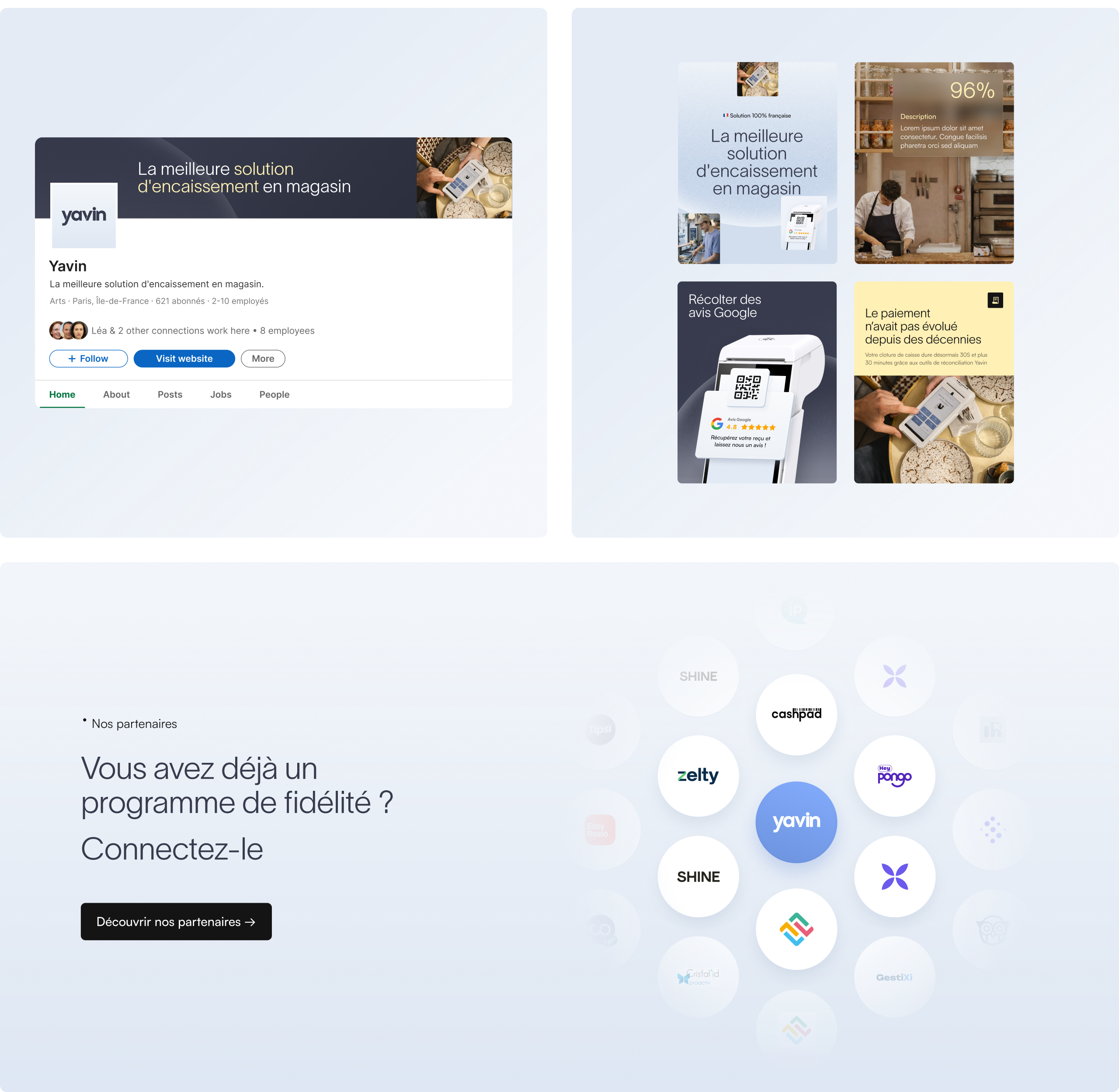
We started again from the narrative, then rebuilt the visual identity and the website around a clear positioning: a French payment solution, premium and innovative.
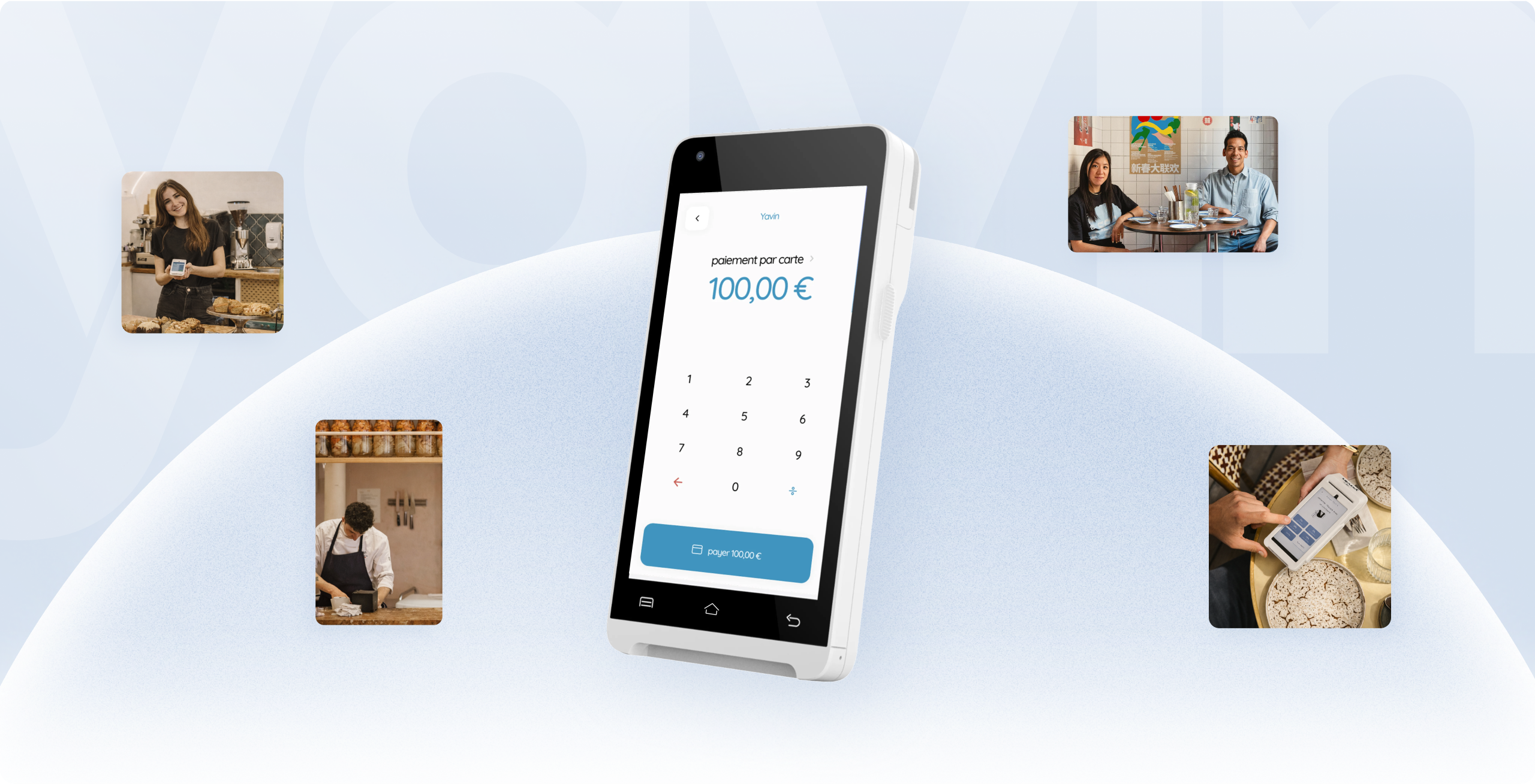
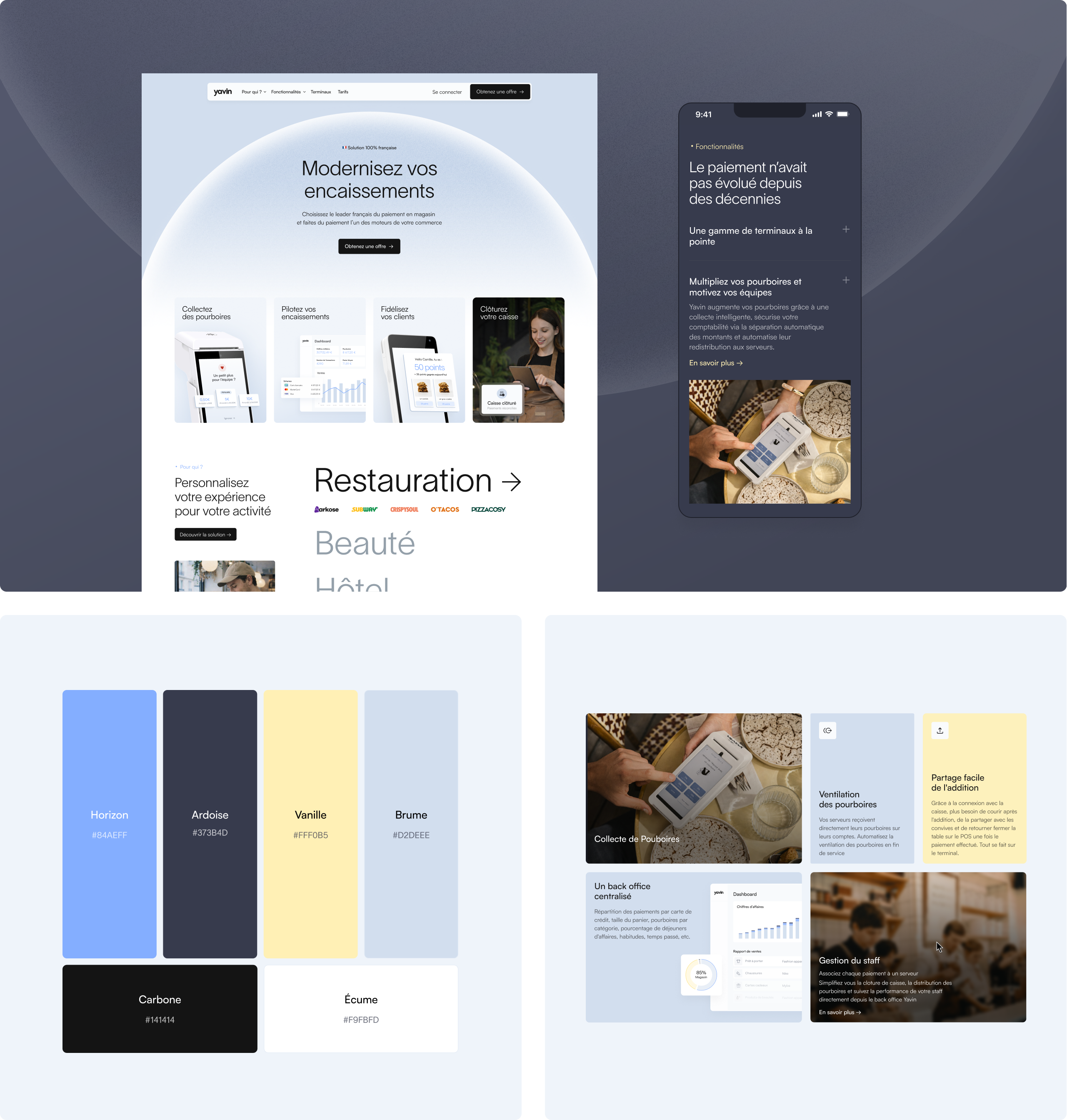
The identity gained in lightness and refocused on the product. The palette was reworked around a dominant white with a sky blue gradient, drawn from the codes of major technology brands. A finer typeface asserts the move upmarket without giving up the brand's technological codes, while a graphic system of spheres, echoing the name, establishes a recognizable signature.
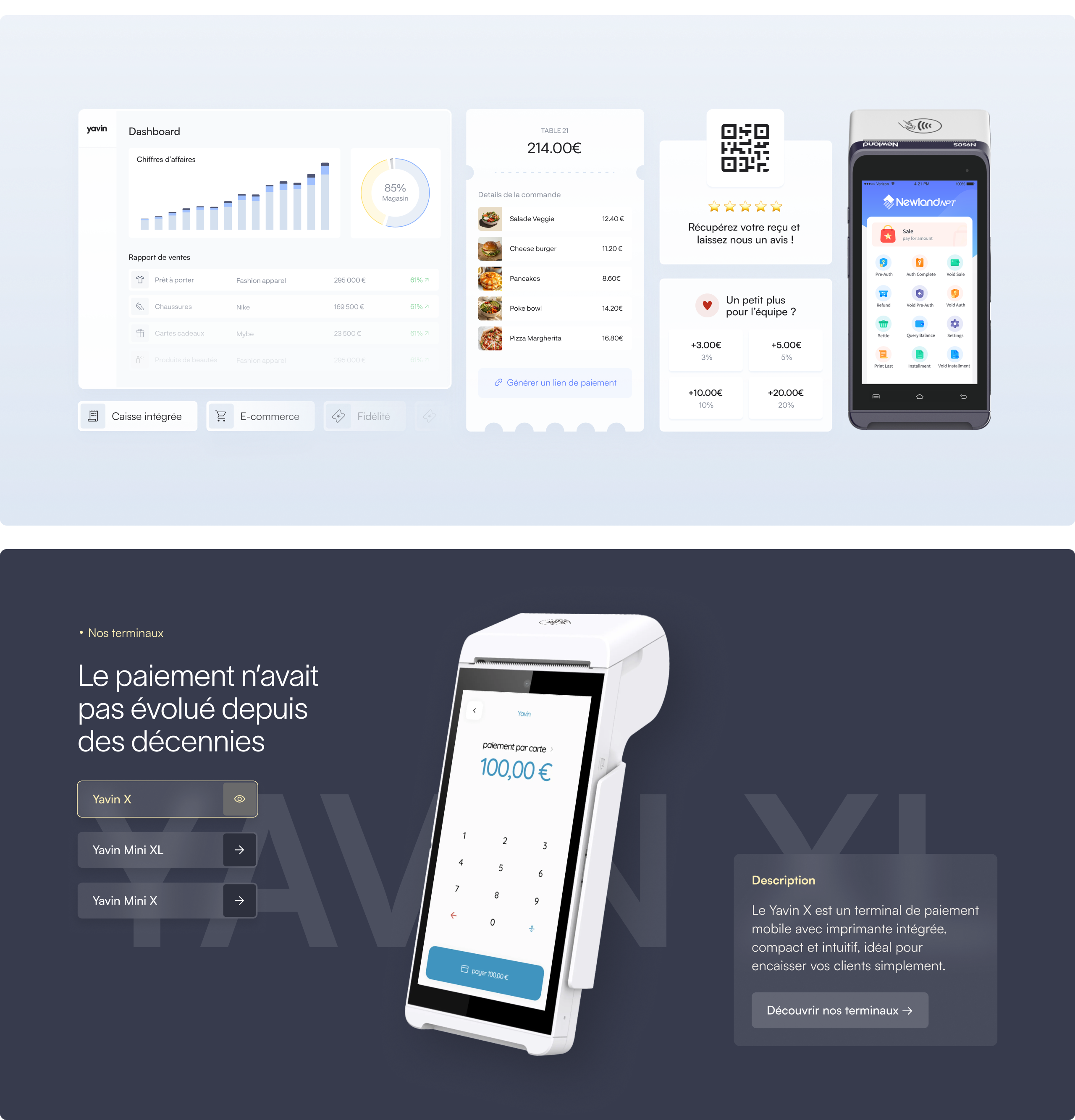
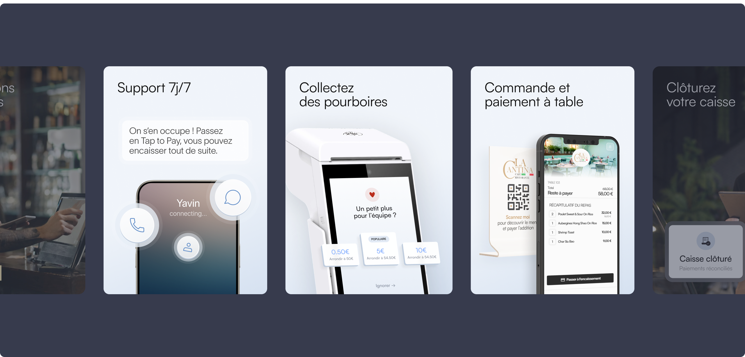
The website now gives as much space to the hardware as to the SaaS platform. Interface views throughout the pages make the product concrete and easy to grasp, and the range of use cases was expanded to show how the solution adapts to very different kinds of retail. A motion design layer runs across the whole experience and brings the rhythm the positioning calls for.

.webp)