1Point6

We recently had the pleasure of supporting 1POINT6 — the agile and sovereign payment infrastructure for regulated platforms — in the complete overhaul of their brand: platform, positioning, personality, tone of voice, and visual identity.
Here’s an overview of the fundamentals of the new visual identity, whose challenge was to capture the unique DNA of a fintech challenger that combines proximity and technological excellence:
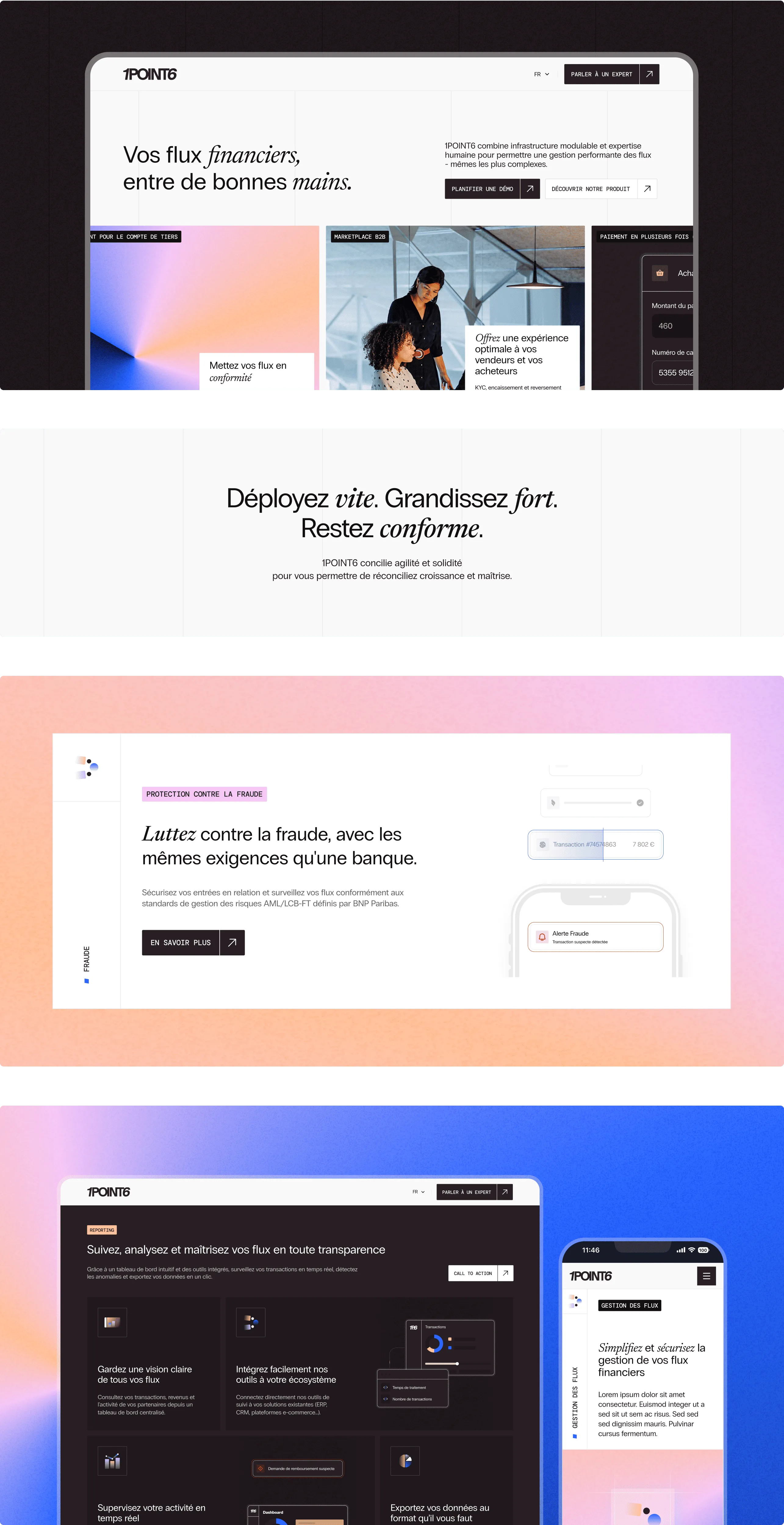
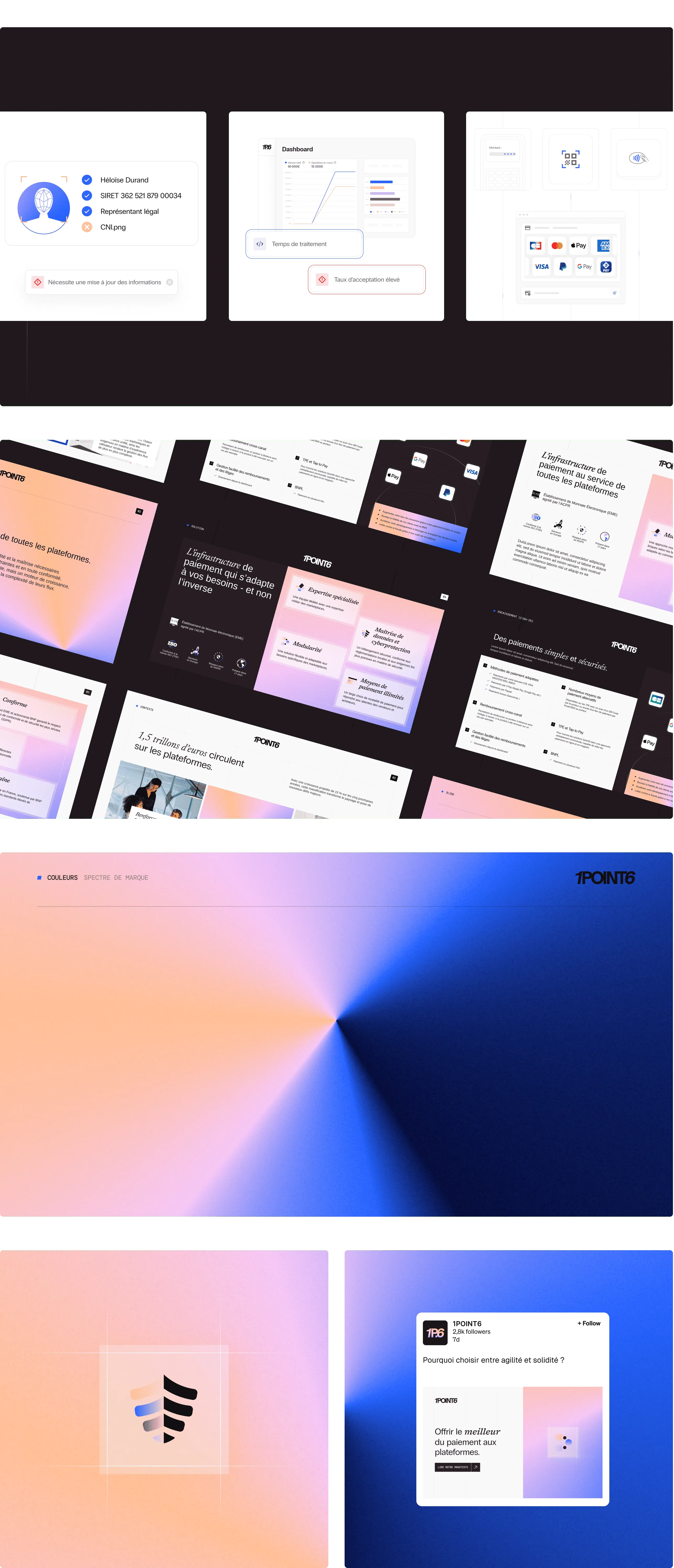
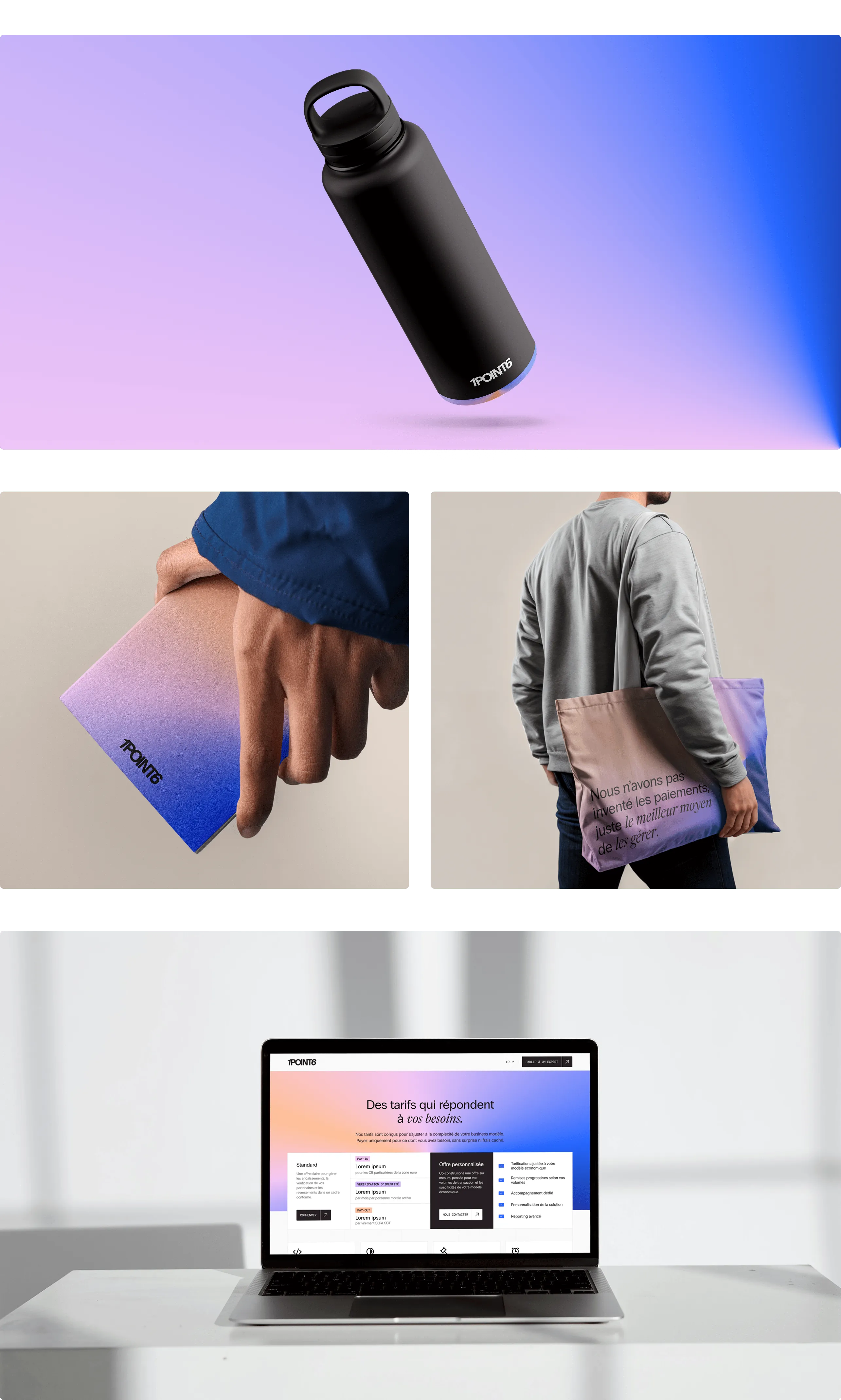
• The color palette associates cool tones (blues, lavender) with warm ones (peach, pink, plum), finding the right balance between technology and human proximity. When applied as gradients, they become a strong identity element and make visual creation easier for the team.
• The typographic trio brings together modernity (Radio Grotesk), energy (Newsreader) and technical precision (DM Mono). Combined with a grid system, it conveys a structured, tech-forward image. Other graphic elements, like the rounded and elegant icons, soften this effect and bring delicacy.
• The use of photography helps humanize the brand and illustrate the diversity of cases that 1POINT6 addresses.
We’ve applied the visual identity to the website and continue to support the teams across all their design and strategy needs: brand roll-outs (sales materials, social media posts…), positioning (key messages, LinkedIn content…), product marketing (use cases, blog content…) and more!

.webp)