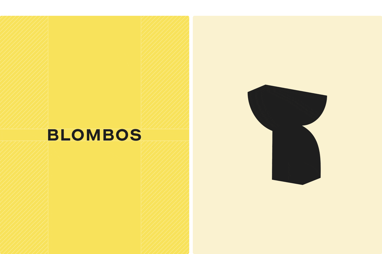
Blombos

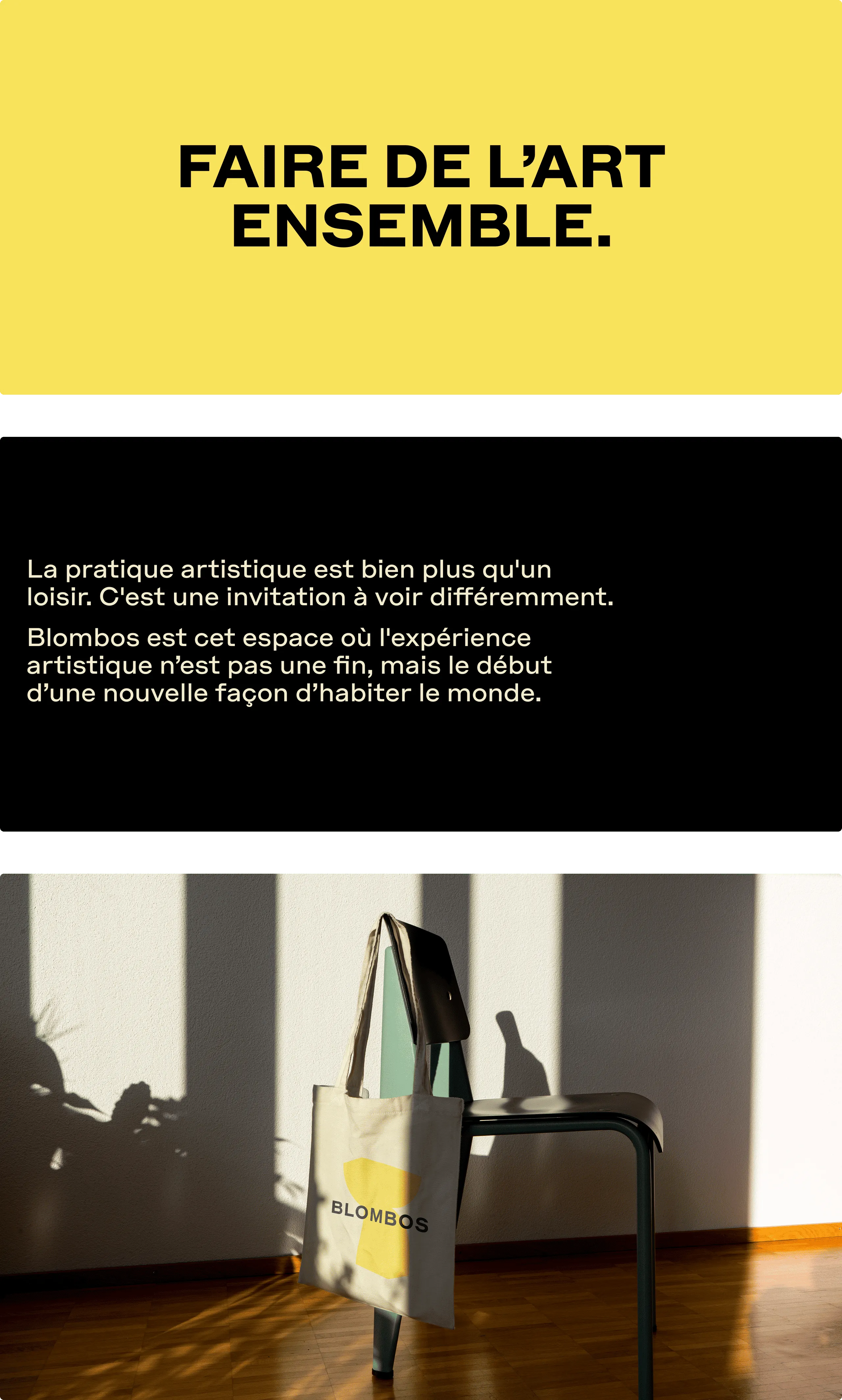
We recently collaborated with Blombos, the complete ecosystem dedicated to artistic practice, as they refreshed their name and repositioned their brand.
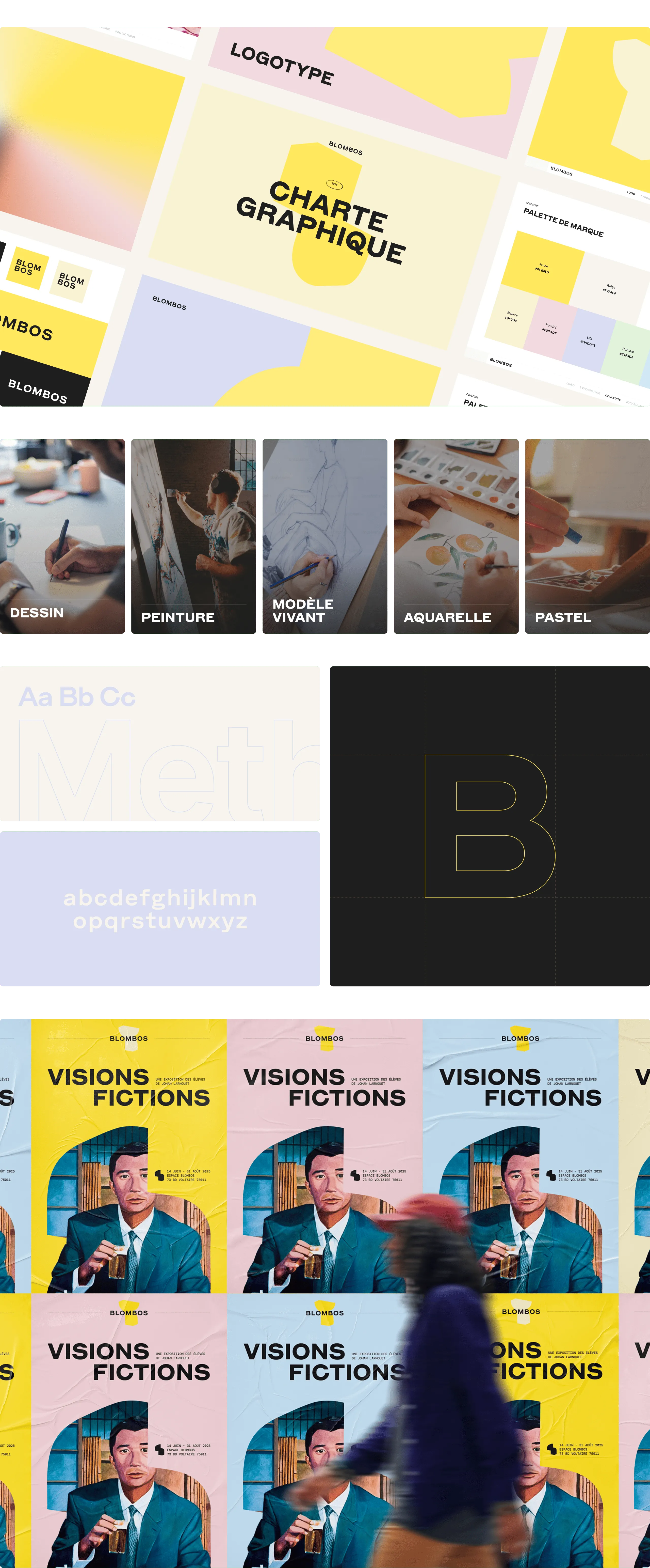
They asked us to design their new visual identity and update all their communication supports (social posts, website, brochures, storefronts, etc.).
The shift? Moving from “the neighborhood drawing school” to a space where artistic practice is no longer an end in itself but the starting point for a new way of seeing and experiencing the world.
We needed to create a bold identity while keeping it flexible enough to welcome every style and form of art — without ever overshadowing the students’ work.
Here’s how we did it:
• The Blombos logo is built on a geometric, all-caps typeface that is both raw and elegant. Its visual neutrality gives full space to creative expression, while the use of capital letters gives it a strong presence and positions Blombos as a clear reference in the world of artistic learning.
• The brand palette is soft and bright, reflecting the studio’s teaching approach. Blombos yellow is paired with a wide range of pastel tones (powder, lilac, apple, sky, coral, terracotta) so the identity can naturally blend with the many colors found in students’ creations.
• The graphic system is based on a set of simple, modular shapes. They express the brand’s core idea “change your perspective to change the world” by evoking diversity of viewpoints, freedom of interpretation and the ability to rearrange and recombine endlessly.