Hexa

While working on their book The 10x Method, we partnered with Hexa to revamp their visual identity and rethink their website.
A few years after our first art direction for them, their team came back with a simple desire: refine their image without disrupting everything. The goal was to rework their existing visual codes and introduce new ones to create something more contemporary, minimalist, and user-friendly. Another key objective was to transition from a tech-centric visual language to one that felt more human and approachable — in particular by using more photography.
In order to bring this change to life, the identity was redesigned around Art Déco references and the visual language of world expositions — a register that conveys notions of construction, structure, and technicality while evoking ideas of future, industry, and innovation:
• The most visible change lies in the typography. Space Grotesk, which carried strong tech connotations, was replaced by PP Talisman, a condensed and highly distinctive typeface that asserts a strong visual presence while maintaining a retro-futuristic elegance.
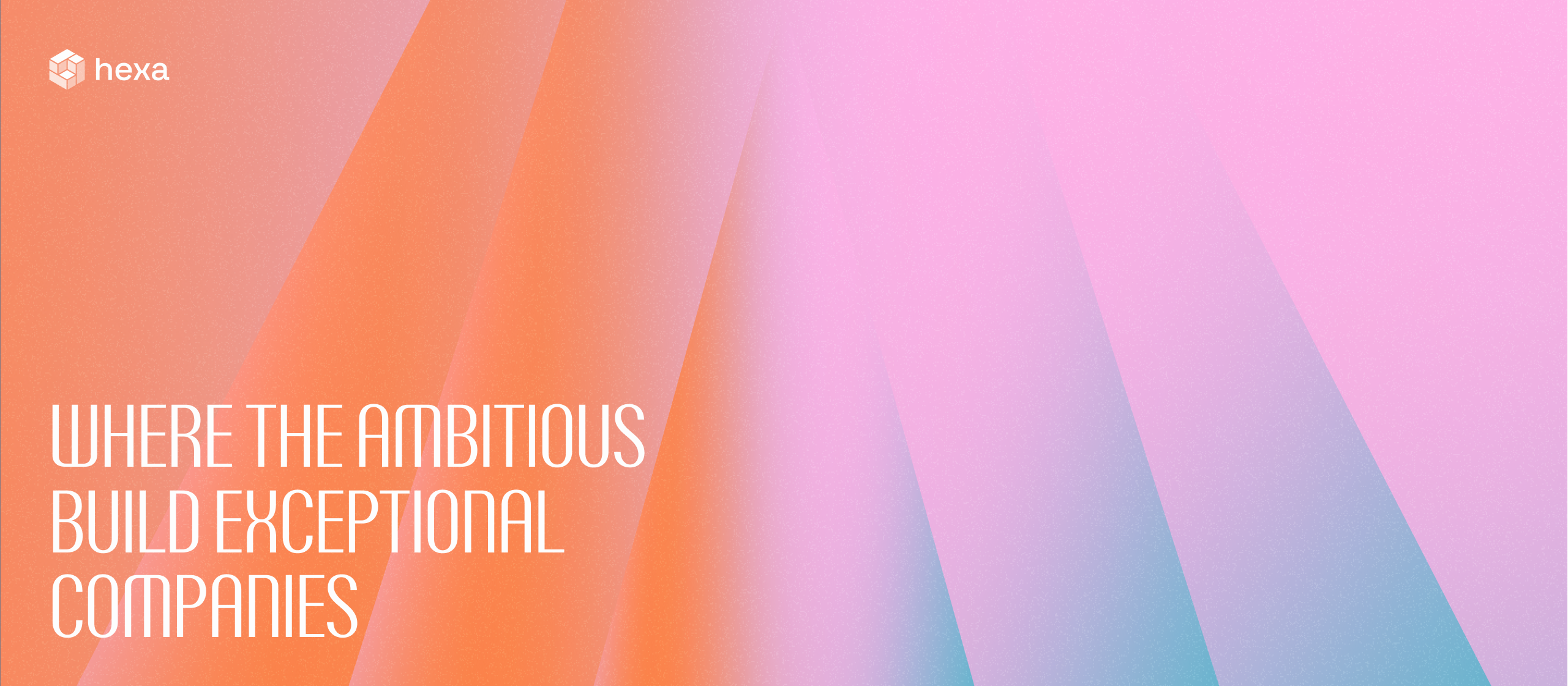
• The color palette remains the same but has been rebalanced. We moved away from a wide and saturated gradient (from pink to green) to softer, brighter shades with rosy-orange tones. Both on the website and in visual compositions, dark mode was replaced by white and light grey to enhance clarity.
• A new pattern has been introduced. Arrows now form a recurring motif that symbolizes motion, momentum, and precision. Some are subtle, almost hinted at, while others are more defined and structured.
• Illustrations now follow a unified system. The multicolored geometric shapes have been replaced by a single cubic module directly inspired by the logo. This cube, rendered in different heights, is filled to varying degrees depending on the concepts being illustrated.
.png)


.png)

"C'est assez simple la recette finalement, il suffit de travailler avec les meilleurs ! Bravo à l'équipe Alasta pour ce superbe travail !"


