Mio

Before the streaming era, the challenge was finding content.
Today, it's choosing what to watch.
According to a US study, the average Netflix user spends over 100 hours a year deciding what to watch, nearly 17 minutes per session before even hitting play (UserTesting, conducted by Talker Research, 2024).
As catalogs keep growing, the decision only gets harder. One in five people say choosing a program is more complicated today than it was ten years ago, and 41% point directly to catalogs that have simply become too vast.
This is exactly where Mio (formerly Memorizer AI) comes in.
A personal culture assistant designed to help you make the right calls and spend more time on what truly moves you, whether that's movies, series, books, outings, or restaurants.
The app originally helped people better remember what they'd experienced. Over time, though, a new challenge emerged: before remembering, you first had to know what to choose.
That need is what pushed the Mio team to rethink the brand at its core. Beyond adding an AI agent to guide users through their discoveries, this new positioning came with a full renaming and a complete overhaul of the visual identity, website, and app.
The goal: evolve Memorizer AI, a cultural memory app, into Mio, a true discovery companion.
Building an app worth spending time in
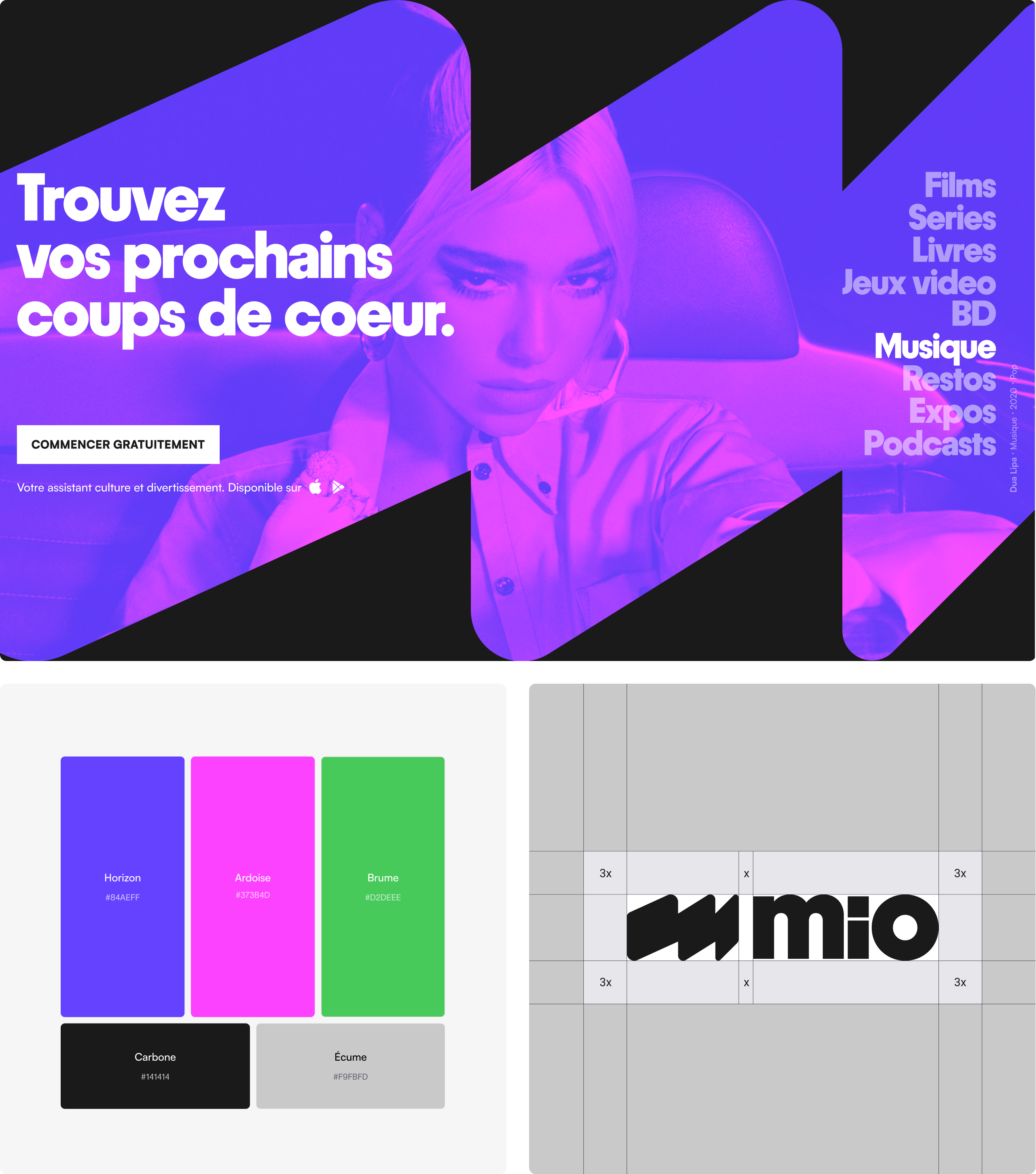
The goal of this redesign was to turn Mio into a place people enjoy visiting, coming back to, and sharing. That feeling had to show up everywhere, starting with the app's front door: the home screen icon. We used Mio's new symbol there, a bold, dynamic shape that evokes the flow of recommendations. Inside the app, we rolled out a brand world carried by a vivid, distinctly digital palette to capture the energy, buzz, and enthusiasm that come with every cultural discovery.
Turning Mio into a pop culture app
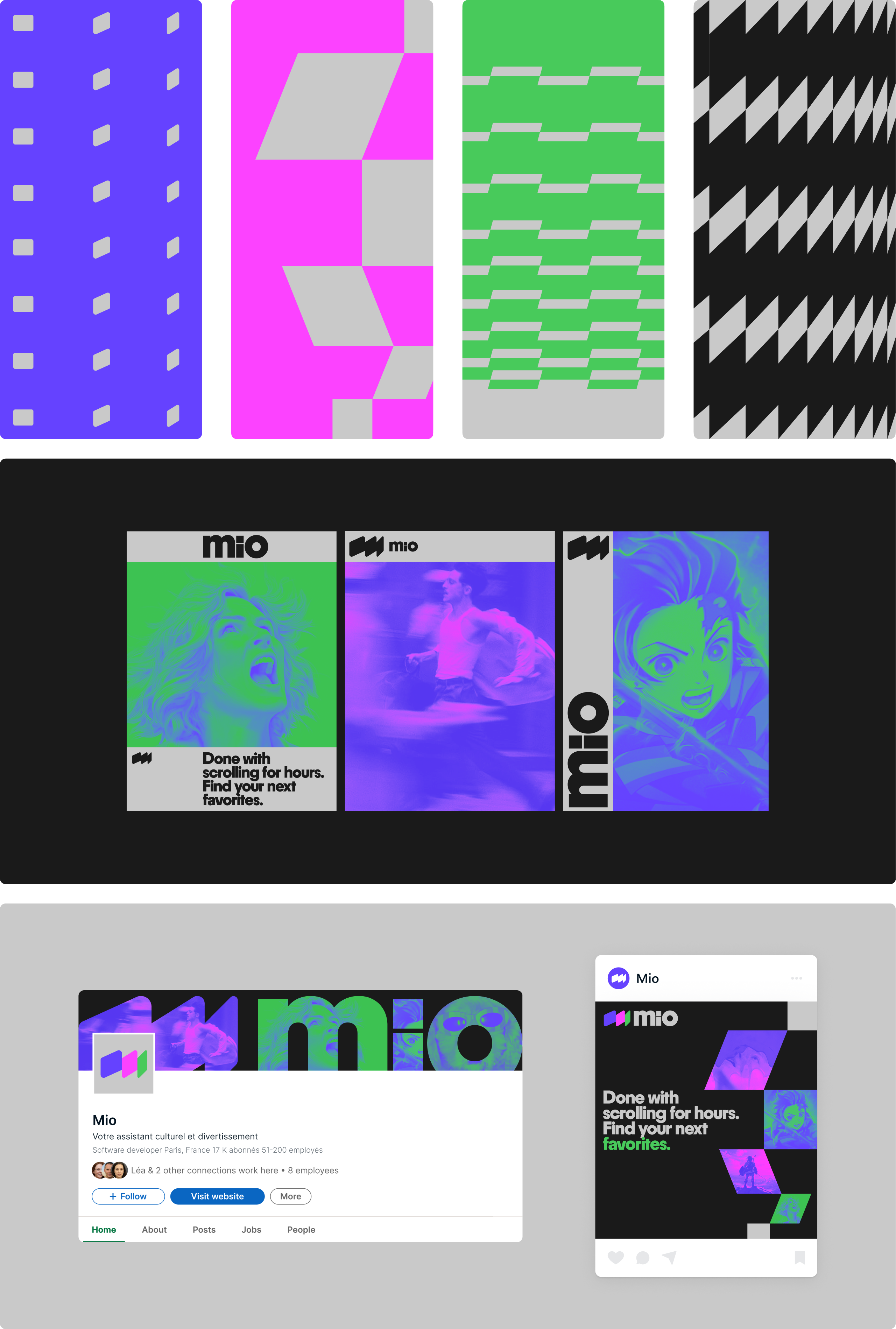
Mio's ambition is to champion a more open, contemporary view of culture, one that celebrates movies, video games, and podcasts on equal footing with books or exhibitions. So we moved away from traditional cultural codes in favor of an identity that's approachable, rounded, and full of life. A "lifestyle" identity as rich and colorful as the works, places, and experiences that fill our everyday lives.

Bringing coherence to a very rich visual universe
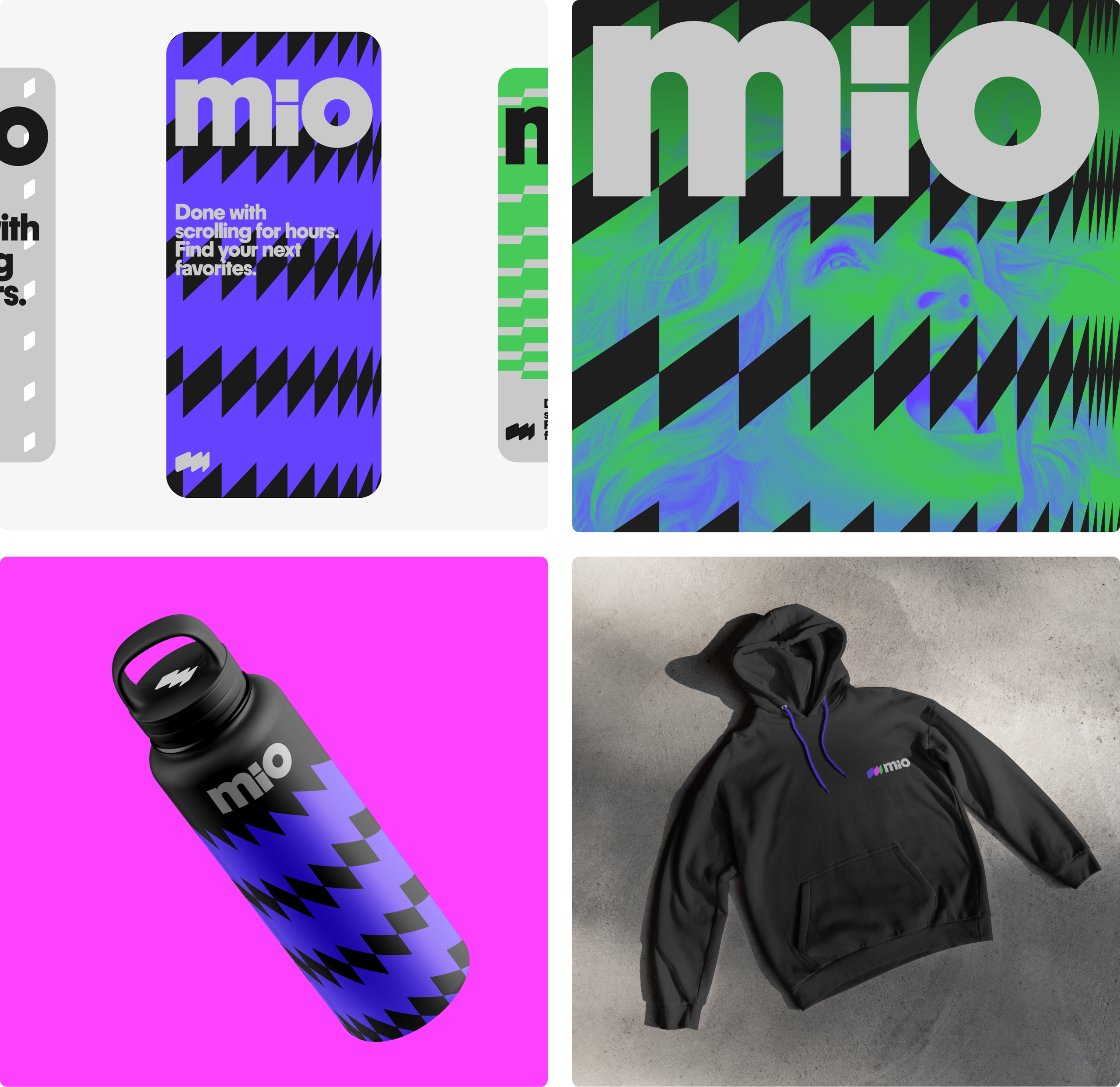
The last challenge, more functional but just as important, was making Mio's identity work alongside thousands of movie, book, game, and content covers, each with a very different visual language. We built a system of shapes, patterns, and graphic treatments to unify it all and make Mio instantly recognizable.


