Tennaxia
By combining software and consulting, Tennaxia helps companies manage their sustainability efforts (ESG, carbon, and HSE), measure their impact and make real progress — day by day.
When they merged with Trace, a key question quickly came up: how do you bring together two identities, two offerings and two teams under one brand, without losing what made each strong?
The goal was to create a cohesive brand — one that helps everyone pull in the same direction and supports their next stage of growth.
Our role? To turn their new brand strategy into a strong visual identity and a website that could help them stand out in a competitive international market:
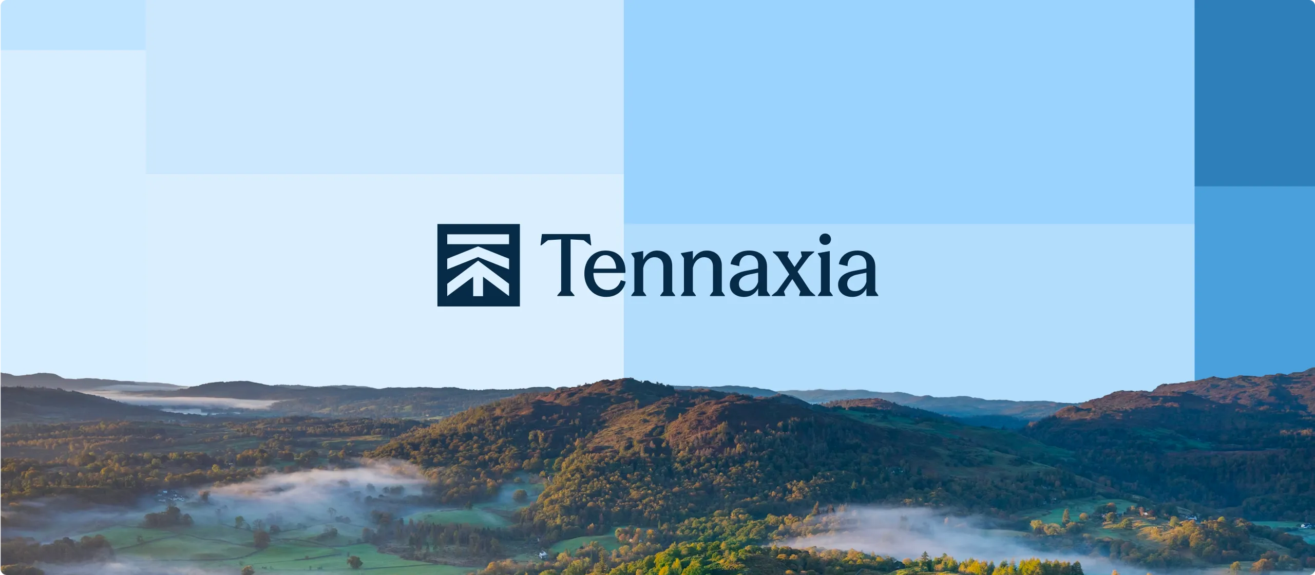
→ The logo reflects progressive transformation by combining Tennaxia’s “T” with an arrow pointing toward a more sustainable future. The lines within the symbol represent the different steps along the way.
→ The color palette is built around two moods: blues that nod to tech and ochres that reference nature. The visual system comes to life through a mosaic of squares.
→ To highlight the SaaS dimension, interface views and simplified product diagrams are featured throughout the site.
.webp)
.webp)

"Notre rebranding était un véritable challenge car il s'agissait notamment de fusionner deux marques installées et de repenser l'identité de celle que l'on allait conserver, Tennaxia, pour la projeter dans une nouvelle ère de modernité. Les équipes d'Alasta ont répondu à toutes nos attentes et ont été force de proposition, toujours avec écoute, adaptabilité et pédagogie. Une réussite à tous les niveaux"


.webp)