Upflow
Your brand might be secretly holding back.
As a company grows, its value proposition naturally evolves. Customer feedback lead to new features, new use cases emerge, the company moves into new sectors… And so the company gradually changes the way it presents itself. But without a guiding idea, it tends to lean too heavily on operational benefits rather than a strong conviction customers can adhere too.
The same goes visually. When every new page, feature, or campaign brings its own design language, consistency and quality quietly erode.
As a result, the brand becomes harder to understand, recognize and trust. And that can stall growth right at the moment you thought the hard part was behind you.
That's exactly where Upflow was headed, but they decided to get ahead of it.
To reclaim a clear and distinctive positioning, they created their own category: Financial Relationship Management (FRM).
Let’s add a bit of context: in B2B, financial interactions are rarely seen as relationship moments. Yet every invoice sent and every follow-up is a touchpoint that either strengthens or strains the customer relationship. Upflow's argument is that the financial experience shouldn't be just an admin layer, but a full dimension of the customer relationship, one that is worth nurturing.
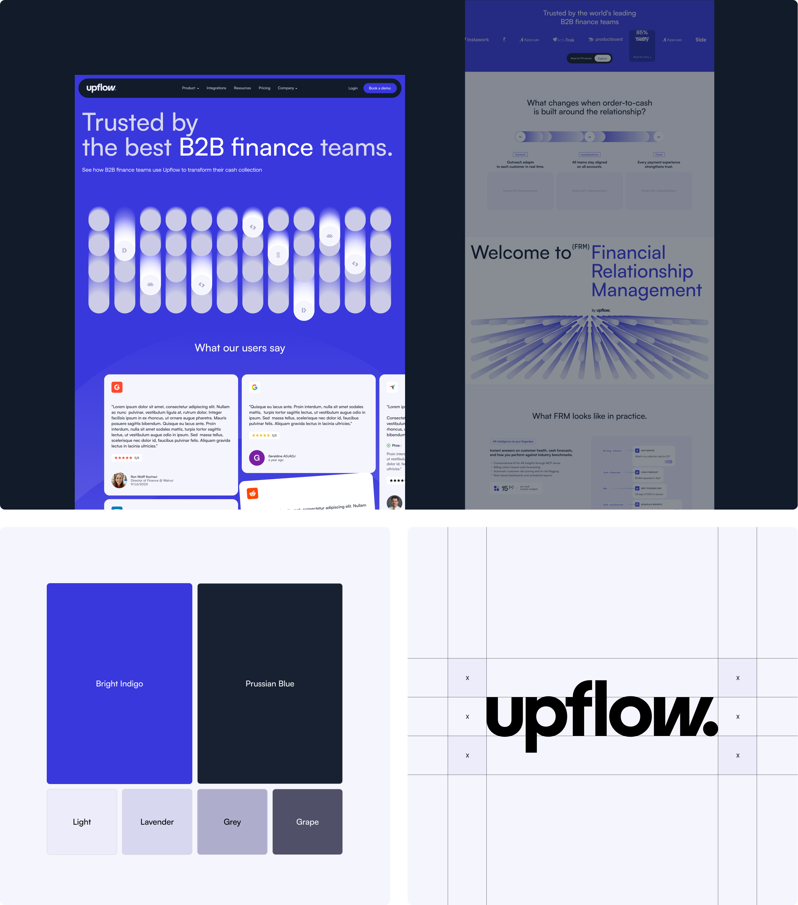
Our role was to bring that new positioning to life through their visual identity and website, bringing consistency across the board.
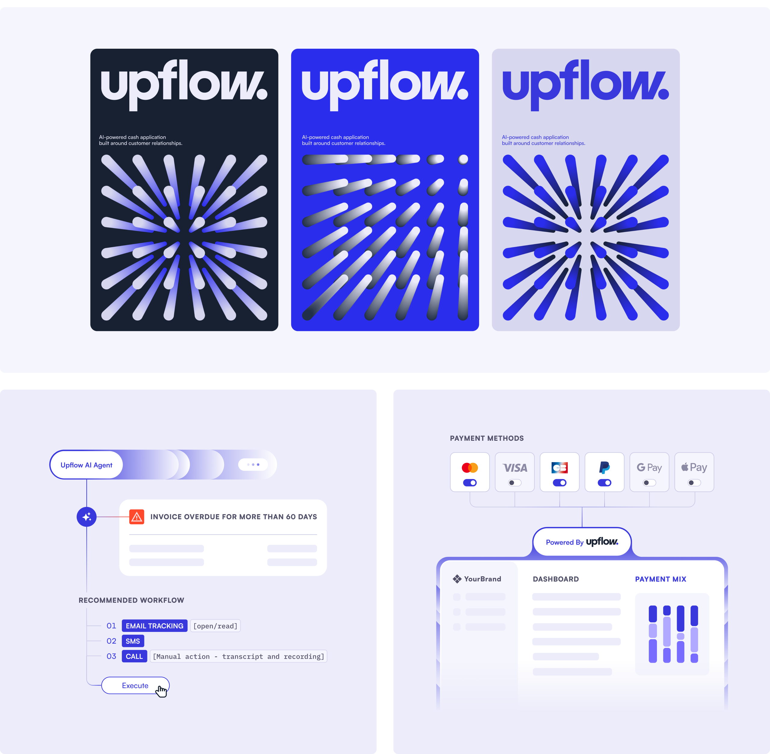
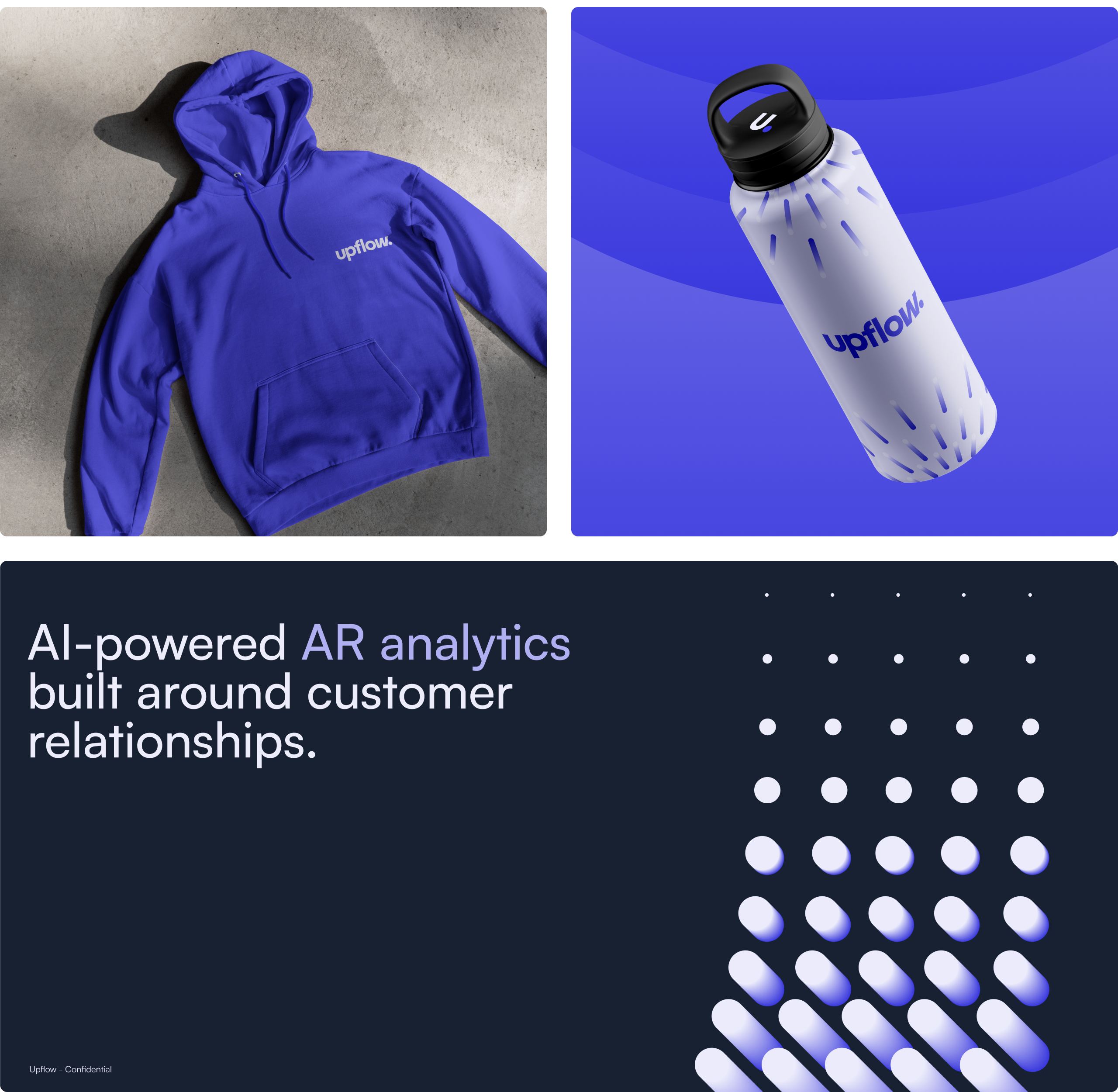
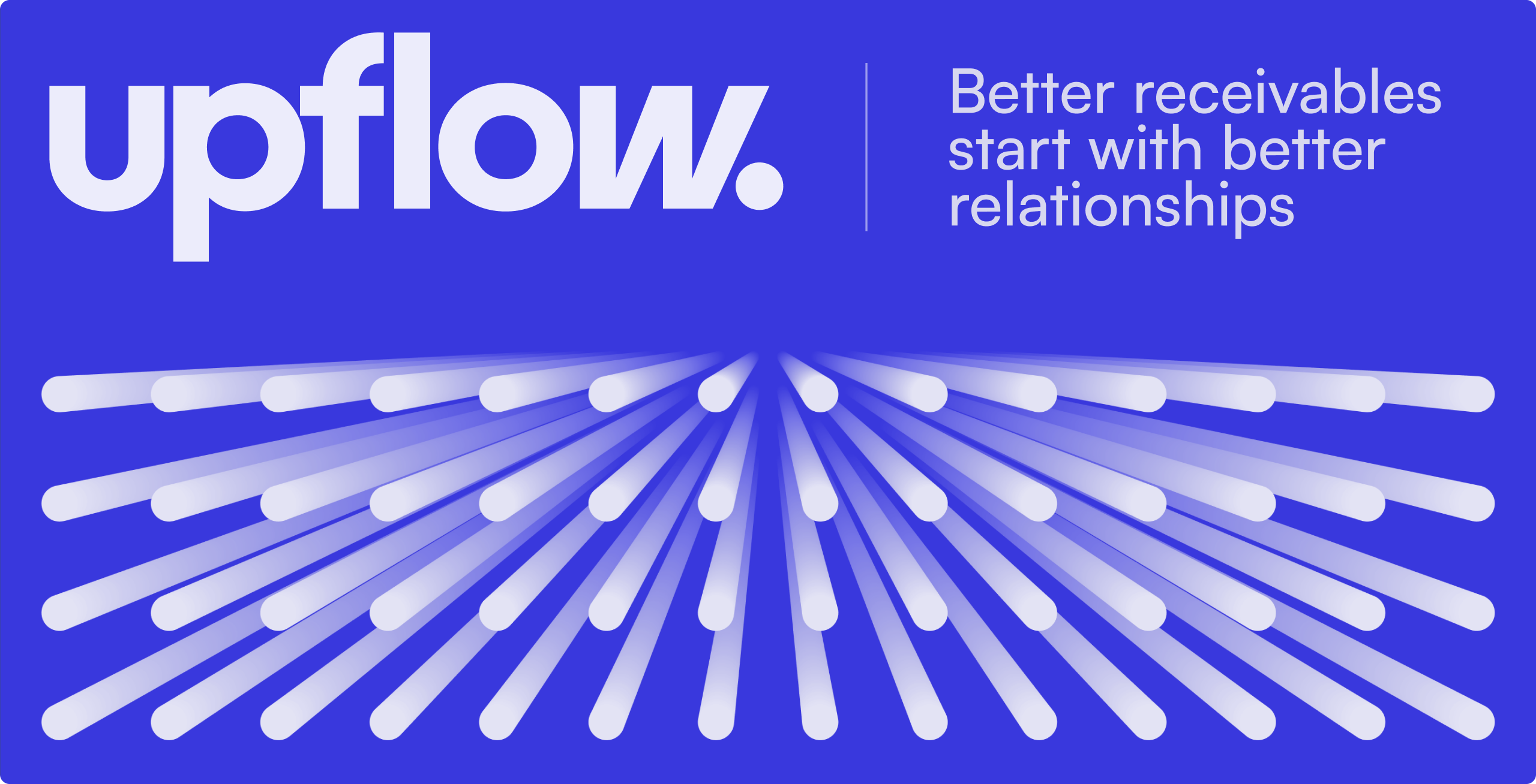
Drawing on the concept of touchpoints and the idea of payment flows, we designed an animated pattern system that sits at the heart of the identity. The logo evokes speed with a slanted "W" that reflects motion and fluidity. The color palette uses a blue that leans toward violet, with a retro tone that gives the brand a timeless feel. Together, the pattern, for which we built a pattern creator for Upflow’s team, and the signature blue give the brand a retro-futuristic feel.
The result is a bold brand that already feels established, designed to support their ambition to own a new category.