Volta

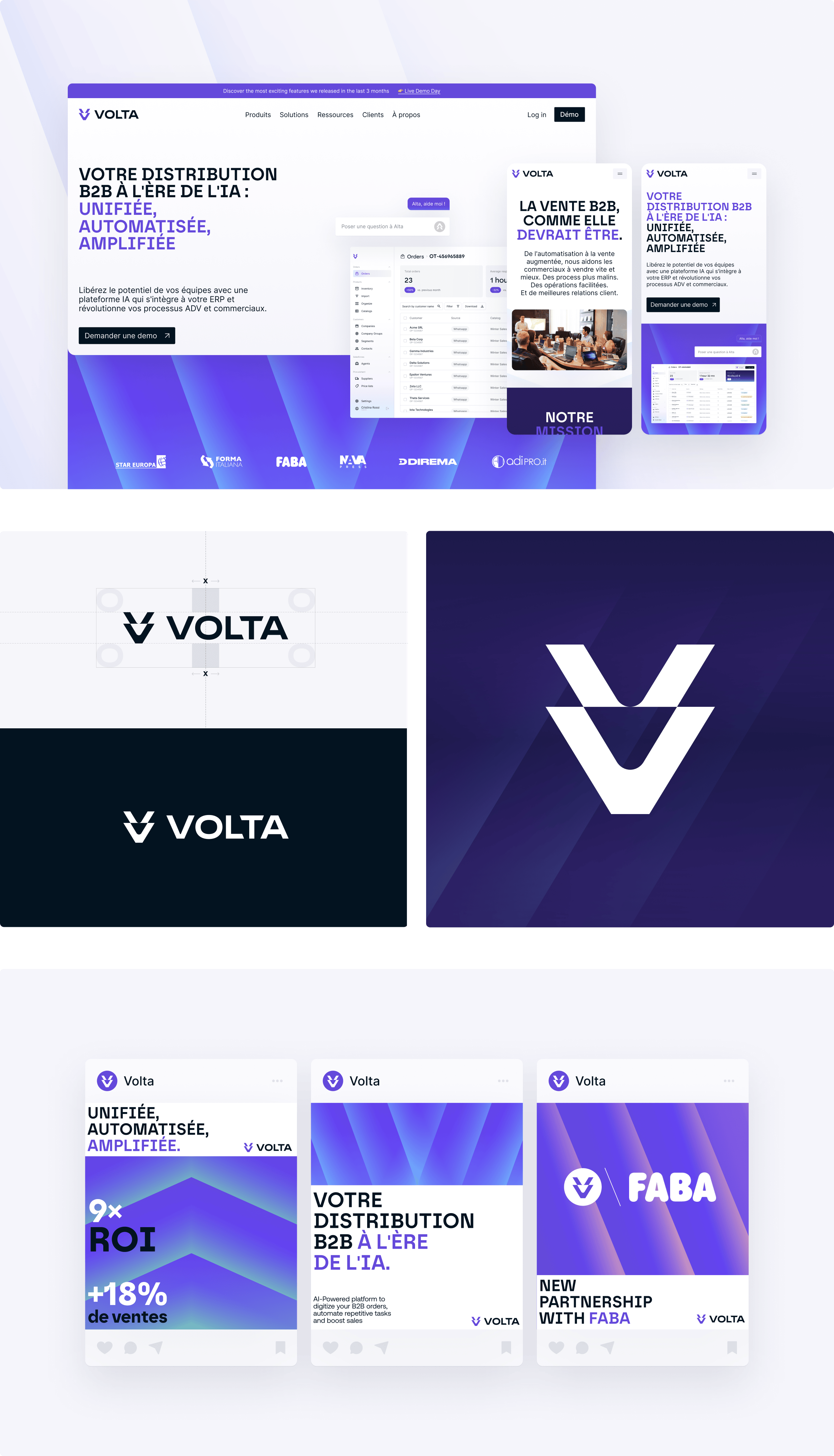
We recently collaborated with Volta — the AI platform that integrates with your ERP and revolutionizes your sales and customer operations — for a complete rebrand.
Their teams wanted a new verbal, visual and digital identity that could own the space and support their go-to-market strategy.
No more overly reassuring, standardized messages: to take things to the next level, we needed a bolder narrative — one focused on clients, their usage and their ROI. In the same way, the brand identity needed more character and presence.
The final goal? Establish Volta as the new B2B standard and prove that AI can be a simple, concrete and adoptable ally for everyone.
Here’s a closer look at our work:
• The new brand positioning puts salespeople back at the center. With the guiding idea “Where sales people win”, Volta redefines its role: freeing teams from operational complexity to give them back time and energy to focus on client relationships and growth.
• Volta’s icon is a stylized “V” made up of two interlocking arrows that symbolize movement and energy. As for the typography, the Borna font is used in titles to express Volta’s distinctly technological spirit, while the Inter font creates balance and adds an accessible touch.
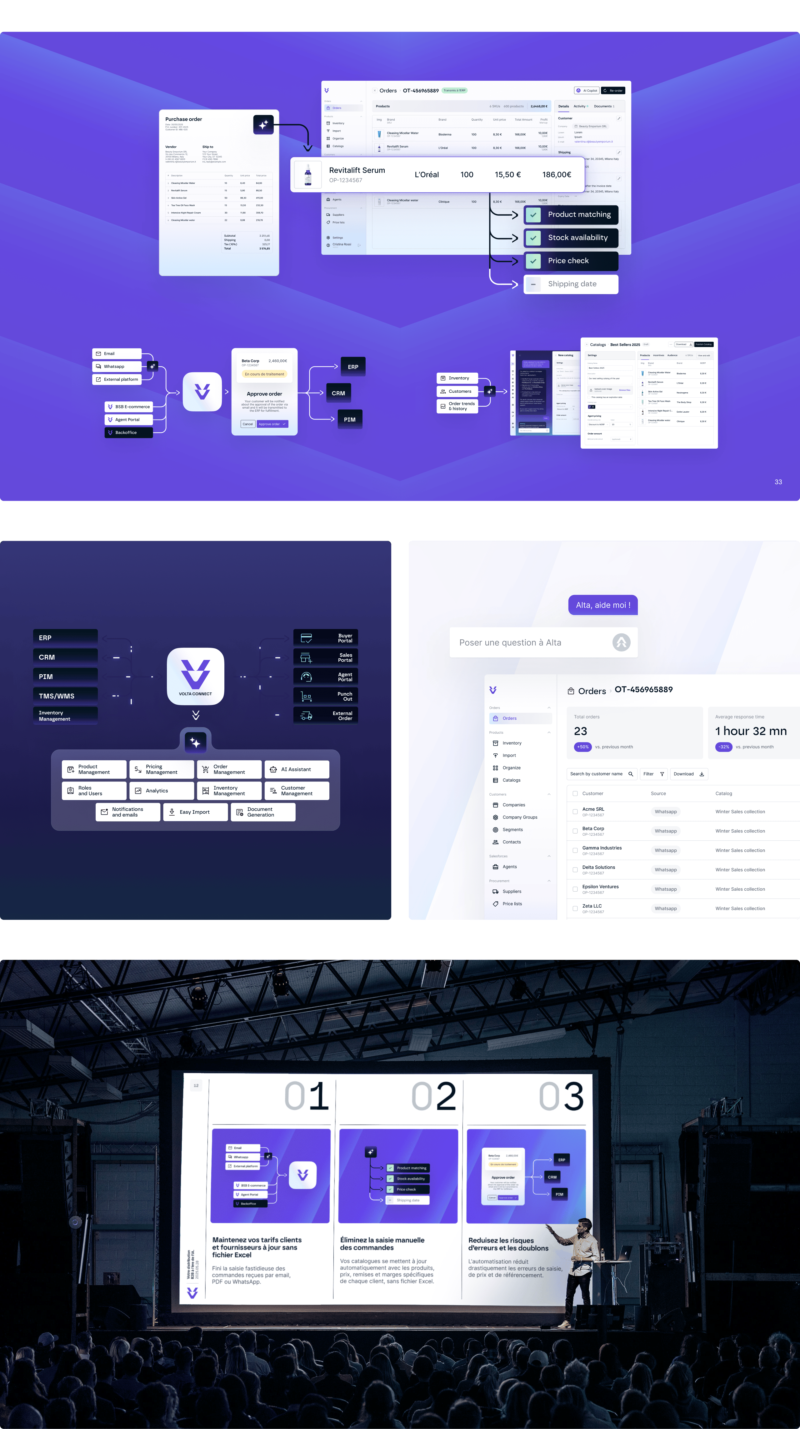
• The gradient patterns evoke the movement of data flows and echo the logo. Product interface diagrams and simplifications emphasize the technical dimension of the product, conveying precision and reliability.


.png)
