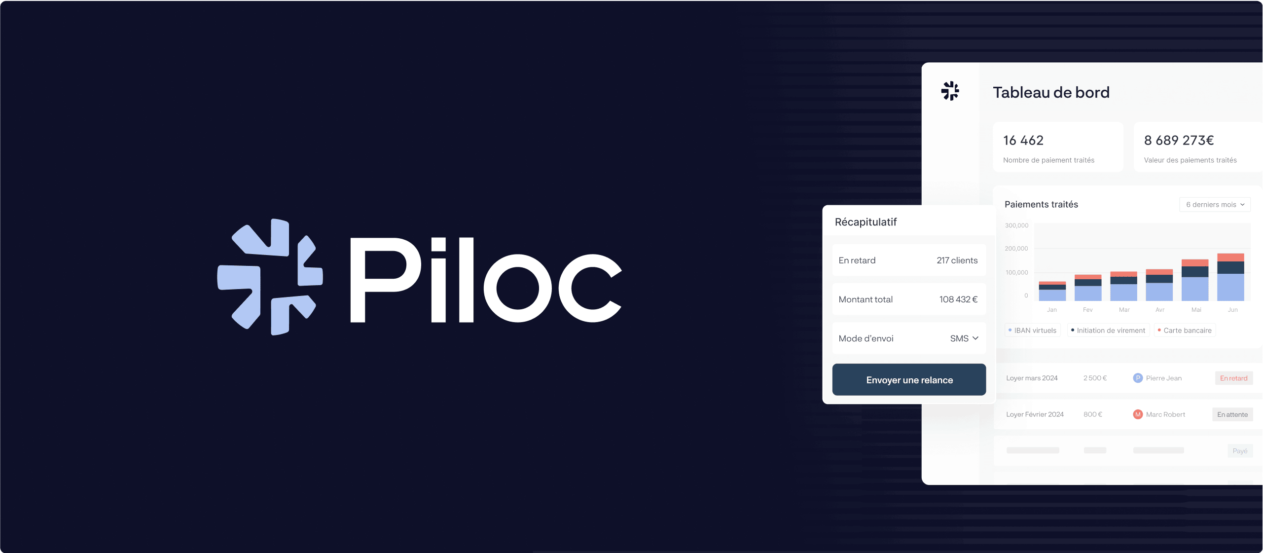
Piloc

Well established and known in the social housing sector, Piloc wanted to move beyond a specific market that was slowing down its potential.
We supported them through this strategic shift by reworking their entire brand expression — from strategy to visual identity and website.
Brand platform, positioning, brand idea, personality, tone of voice, logo, color palette, graphic system, UX, UI… Here’s a look at the work we did together:
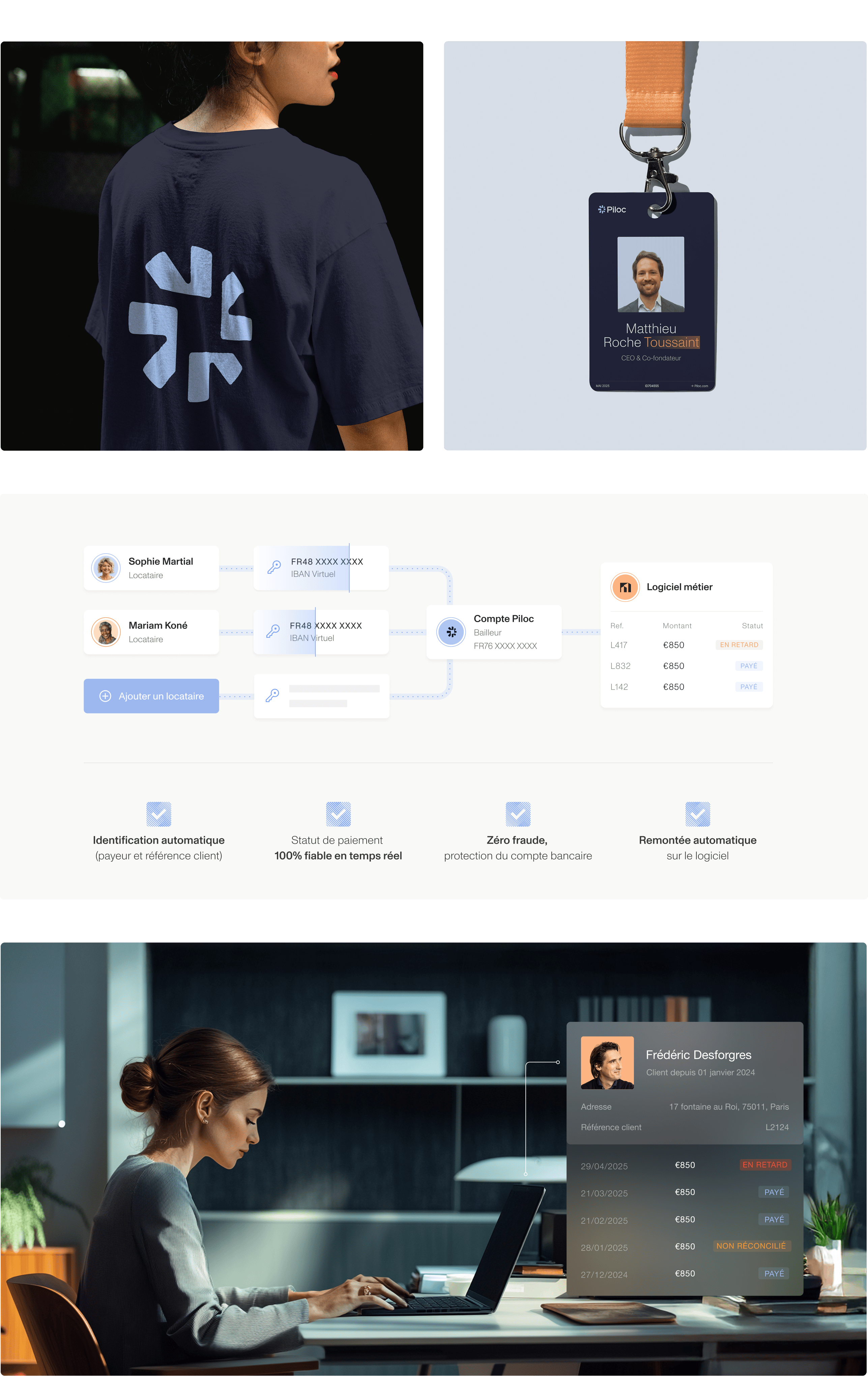
• A real strategic move. Piloc went from being seen as a simple payment tool for property managers to positioning itself as the integrated payment solution built into the day-to-day tools of essential service providers like social housing and childcare, public transport and parking, water and sanitation, collective catering, energy and heating, professional space management and more.
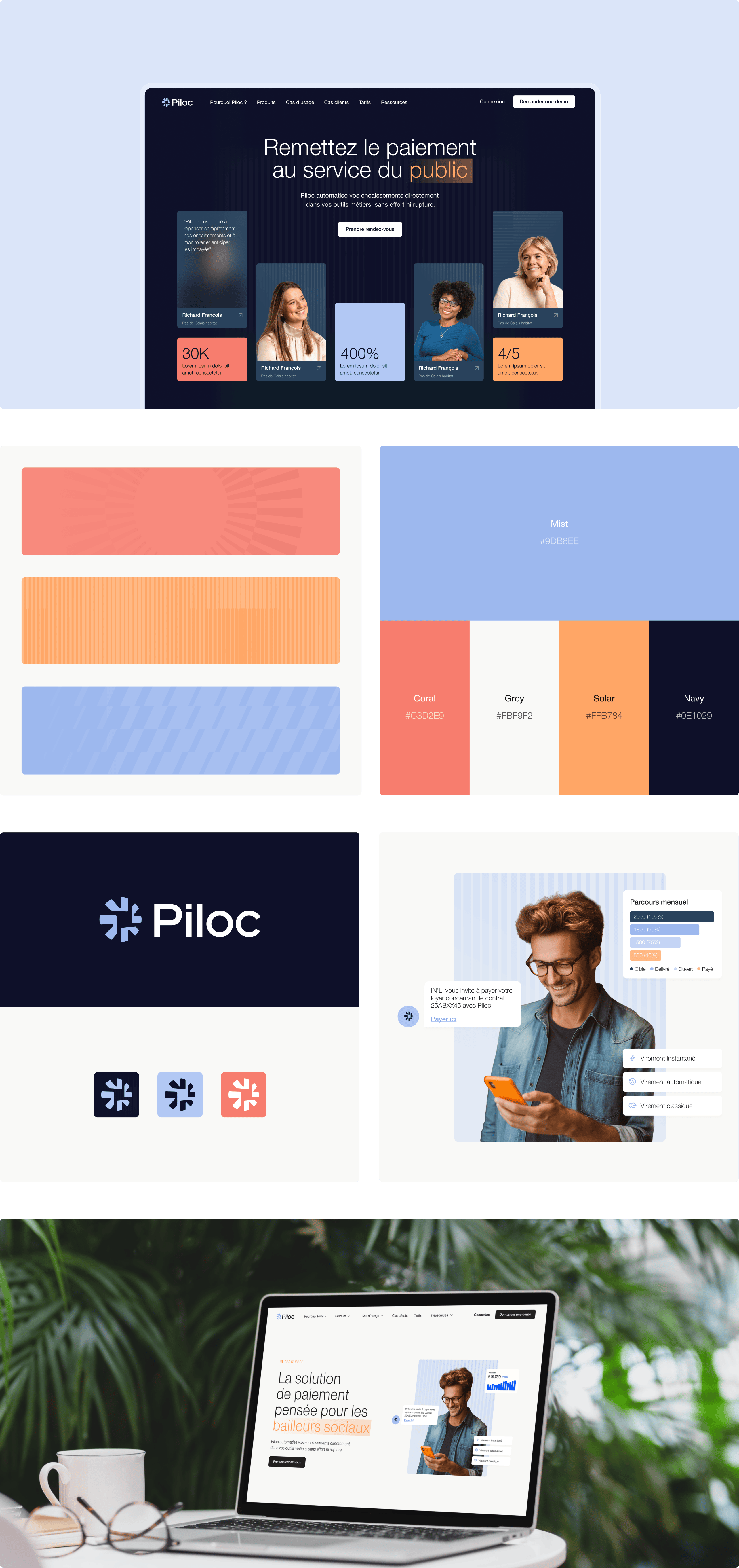
• A clear and strong brand idea. “Le paiement au service de ceux qui servent” now drives the brand story. It comes through in key messages like “Remettez le paiement au service du public” and “La seule solution de paiement conçue pour les métiers qui comptent”.
• A trustworthy visual identity. It was designed to build confidence among players in the real economy and public or regulated sectors. Navy blue and grey anchor the brand in professionalism and seriousness while brighter accents reflect its energy and ambition.


