Nomad Education
How do you show the strength of a brand's commitments without losing sight of its commercial stakes?
That's the question we recently asked ourselves while working with Nomad Education, the app that helps every student revise, find their path, and thrive in their studies.
Until now, Nomad Education mostly presented itself through its product and features, much to the frustration of the teams who wanted to express more of their convictions and their commitment to education.
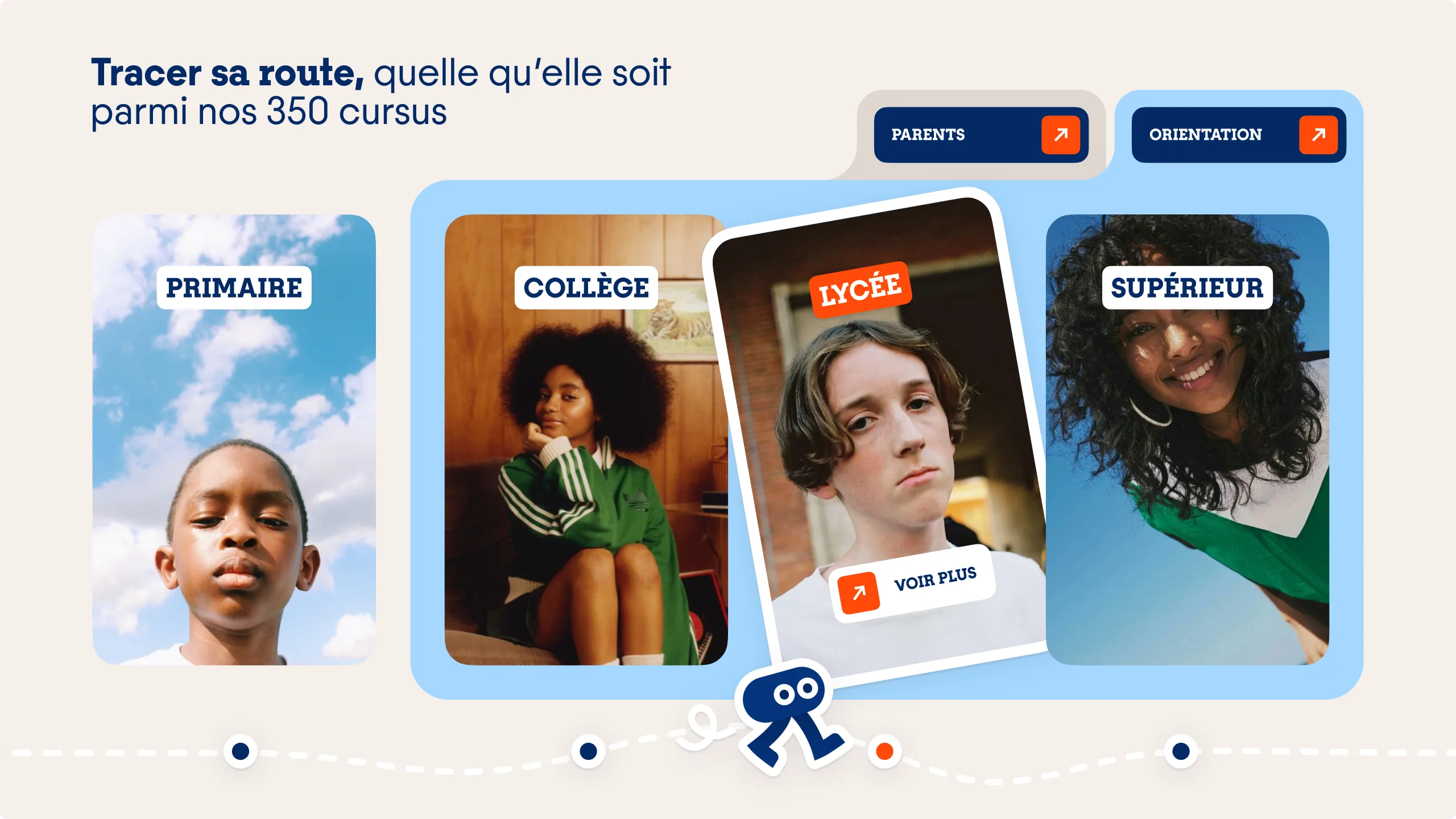
We built the brand strategy around one central idea: succeeding after school and, by extension, in life. The messaging opened up to more aspirational themes around the role of education and guidance in shaping tomorrow's citizens.
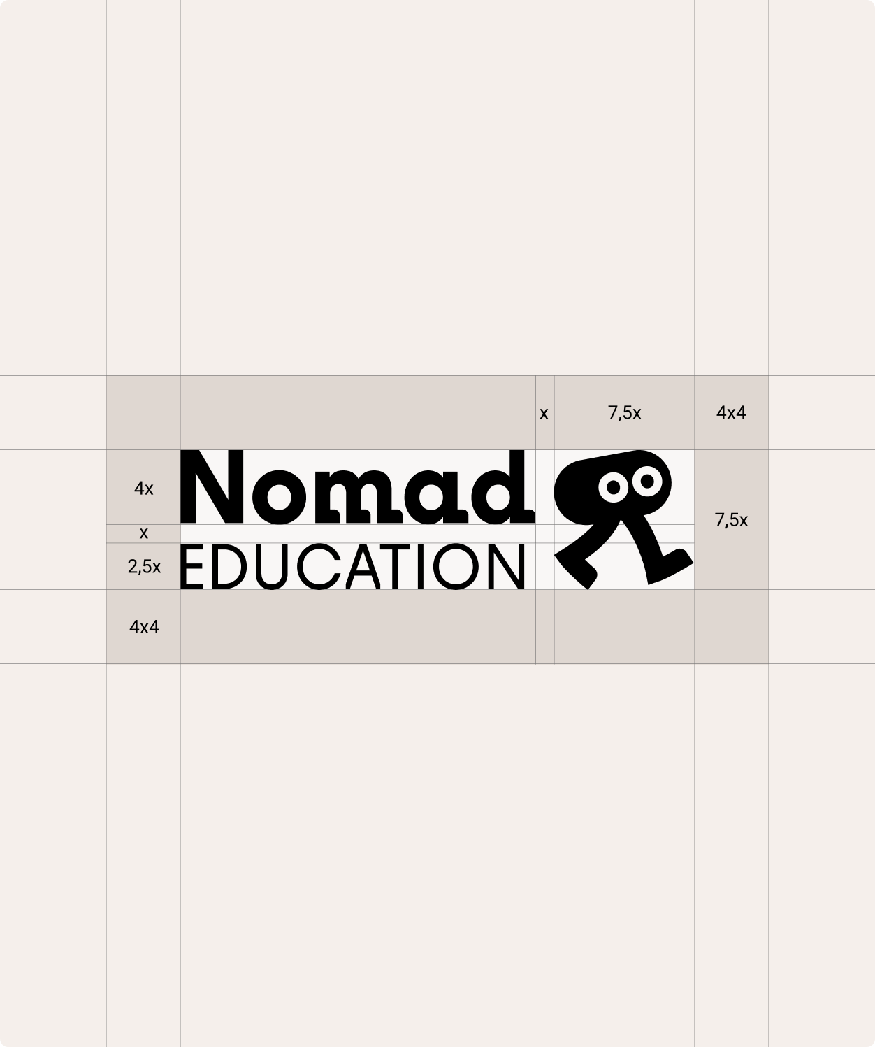
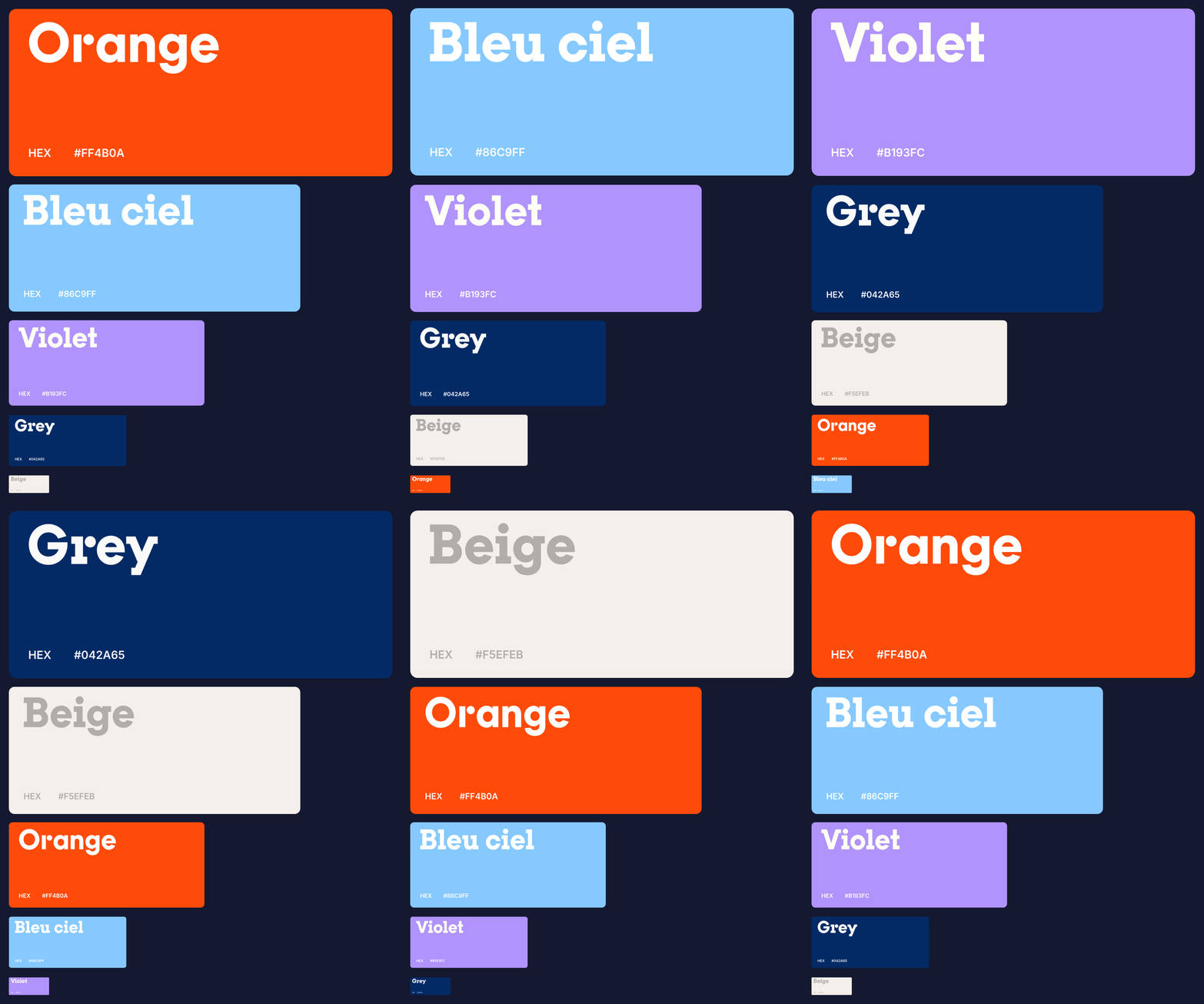
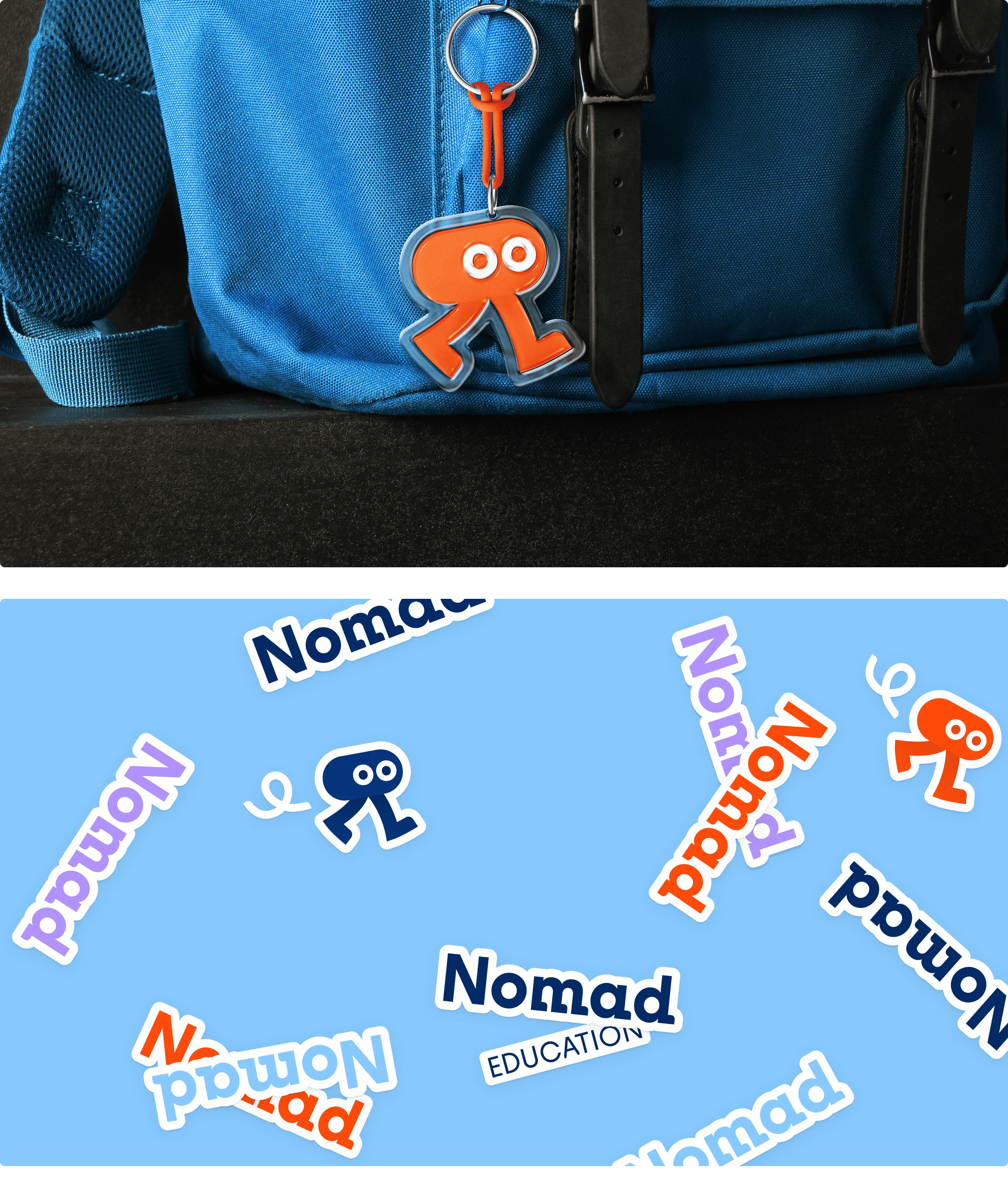
The visual identity reflects that same search for balance: human and authentic to embody Nomad's convictions, with more tech-forward codes to showcase the product. At the heart of the graphic system is a mascot able to speak to a six-year-old and a final-year high schooler alike, embodying autonomy and movement. Orange carries that energy and momentum forward, set against a deep blue that grounds the brand with more technological, established footing.
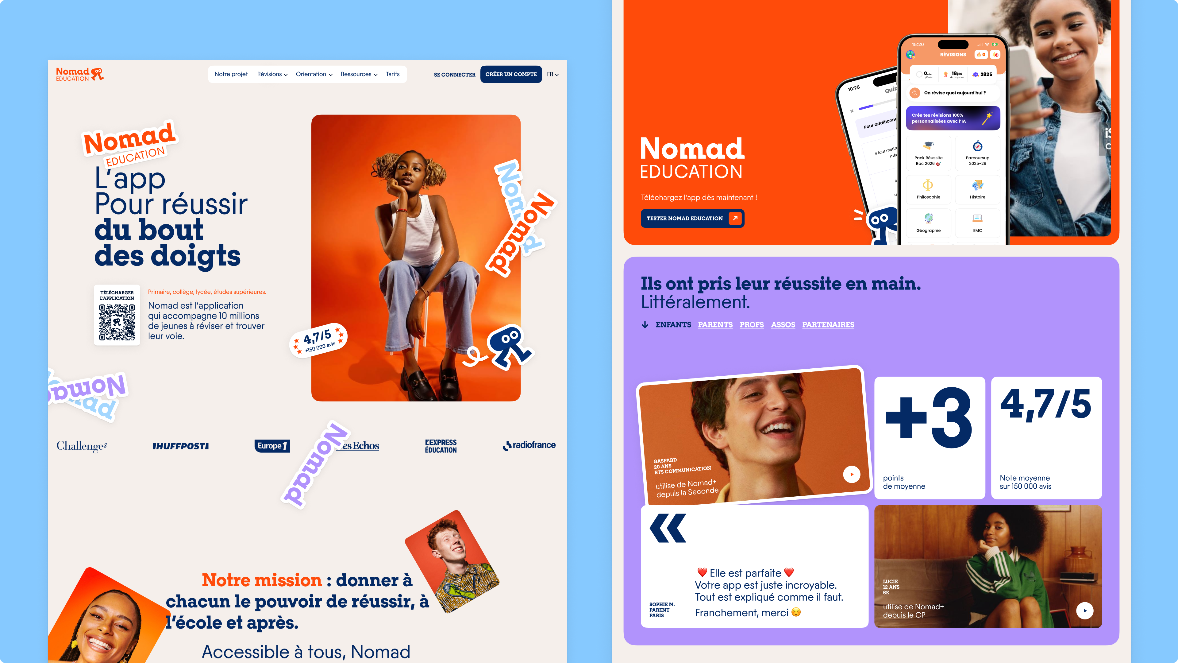
The smartphone, and through it the app (in both its free and paid versions), is now presented as a democratic tool for success: academic, personal, and civic. The app is positioned as an extension of school once class is over, one that gives young people the power to become active participants in their own future.

The result is a brand that can finally say what it does and what it believes in, without the two contradicting each other.