Phenix

We recently had the pleasure of collaborating again with Phenix, the anti-waste solution that turns unsold goods from retailers and manufacturers into economic, social and environmental opportunities. Originally designed for consumers, their teams now wanted to assert their role with food companies, helping them better manage surplus and add value to their unsold products.
We supported them in the redesign of their visual identity and website with two objectives in mind:
• evolving the identity to reflect this new positioning by adopting more B2B-adapted visual codes;
• while preserving what defines their DNA and appeals to the general public, since their B2C offering continues in parallel.
In short? An evolution of the brand image — yes. But not a 180° turn!
Here’s a closer look:
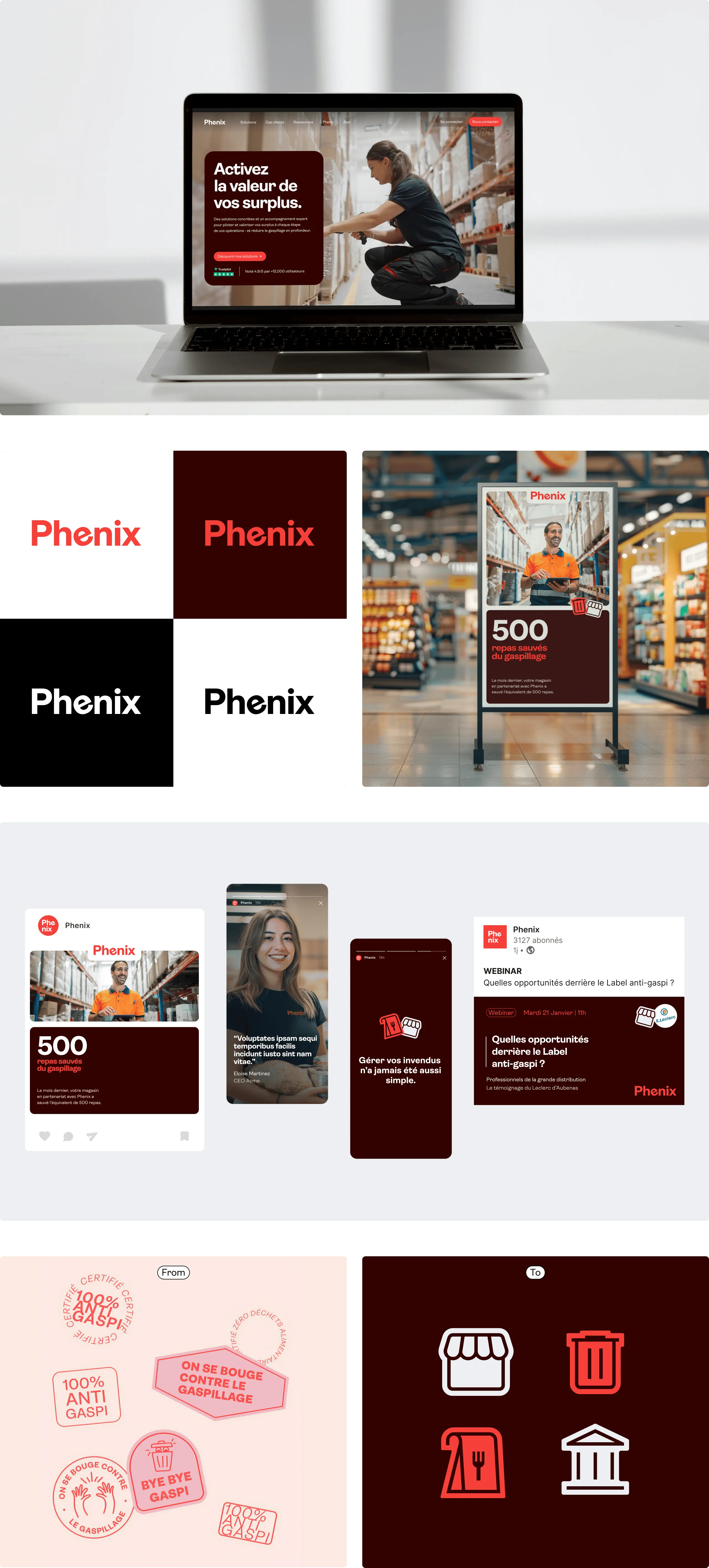
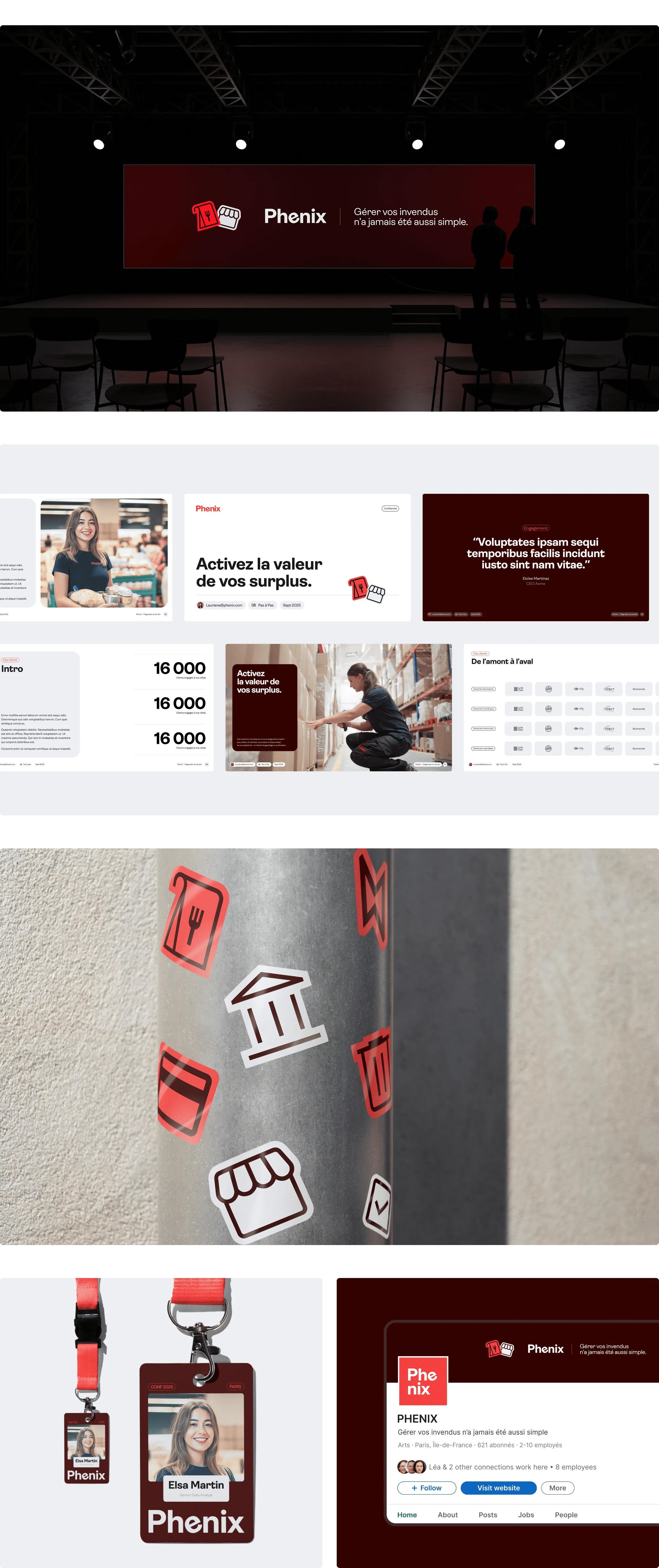
• To preserve brand recognition, we chose to keep the spirit of the logo while refining it for better readability and presence. The slightly tilted “e” was kept to keep the signature touch of originality that reflects the Phenix spirit.
• As for the color palette, we simplified it and transformed the original pinkish-red into a bright red for greater impact. This main color is accompanied by a deep burgundy and shades of grey and white, establishing a more subtle visual universe aligned with a B2B posture.
• The graphic vocabulary — particularly the stickers that have been part of the brand since the beginning — was redesigned with thicker lines and a subtle glossy effect to give it a more premium feel. They are now used more sparingly.