Poppins
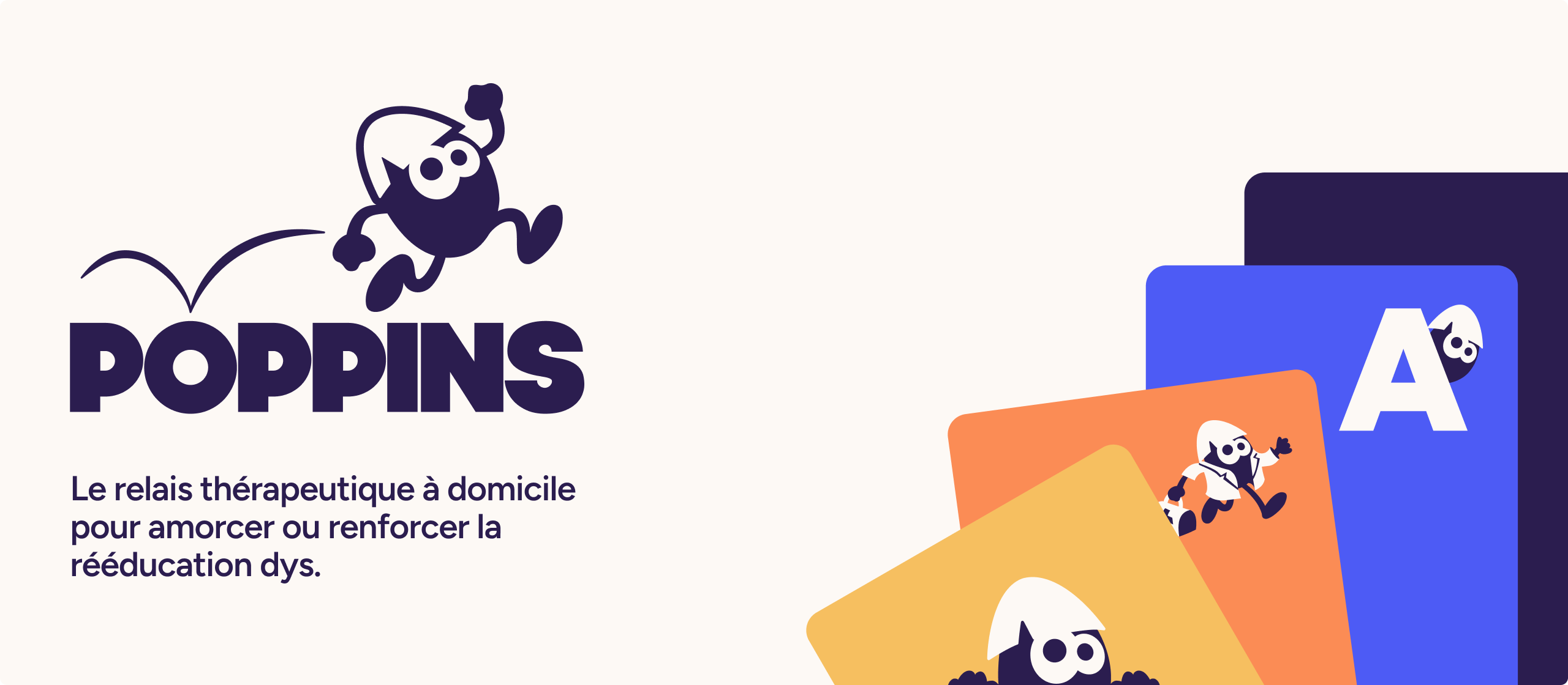
We recently worked with Poppins, which develops digital medical devices for children with specific learning disorders.
In particular, a device that helps dyslexic children learn to read, either before speech therapy begins or alongside it.
Their solution rests on one strong principle: putting the engagement mechanics of video games to work for rehabilitation. A colorful world, badges to earn, a sense of progression. Everything is designed to make a child want to come back the next day.
Because with this kind of care, consistency is what counts. A bit like strawberry-flavored children's medicine: it doesn't work any better, but it helps you stick with the treatment
Across its touchpoints, though, the brand was speaking in verbal and visual codes that were highly institutional (and even cold), on the assumption that this would reassure parents and professionals. What it created instead was a gap that no audience could quite make sense of: the website told the story of a medical solution while the app told the story of an adventure.
So the challenges were:
- Own and clarify a single positioning. The brand speaks to three audiences who want different things from it, but it can't tell three different stories. We built a narrative around the idea of the relay: Poppins isn't there to replace speech therapists, but to extend their work at home. That idea takes shape in the 3 R method: Rhythm, Rigor, Results.
- Align the therapeutic promise with what children actually experience. We developed a graphic vocabulary drawn from gaming: a mascot with real personality, illustrations in motion, a joyful color palette, and a layering principle that suggests progression. The website keeps its reassuring posture for parents and health professionals, while the product leans further into the pleasure of playing.
- Find the right balance between technology and human presence. Poppins is a digital medical device, but it's also a brand with a team that stays close and takes you by the hand. A warm, lively, expressive brand, carried by the characters from the game.
The result is a brand that makes Poppins easier to read, expressing every facet of its identity without pitting video game references against scientific rigor. A brand that also contributed to securing a favorable opinion from the Haute Autorité de Santé, France's national health authority, opening the way for reimbursement of the device by the national health insurance system.
.png)
.png)

.png)
.png)